tidy resampling with anova
In a previous post I showed how to do a permutation equivalent of a t-test using tools from the tidyverse and following the principles of tidy data. Here I’ll show how to do a resampling-based equivalent of an ANOVA using tidy data principles.
Choosing an appropriate test statistic is important for any resampling-based approach. Based on a suggestion in a book I read, I’ll define the between-group sums of squares as the test statistic of interest. This number is large if a lot of the variation in our dataset is between groups; it’s small if our groups don’t differ that much. The example below should clarify this.
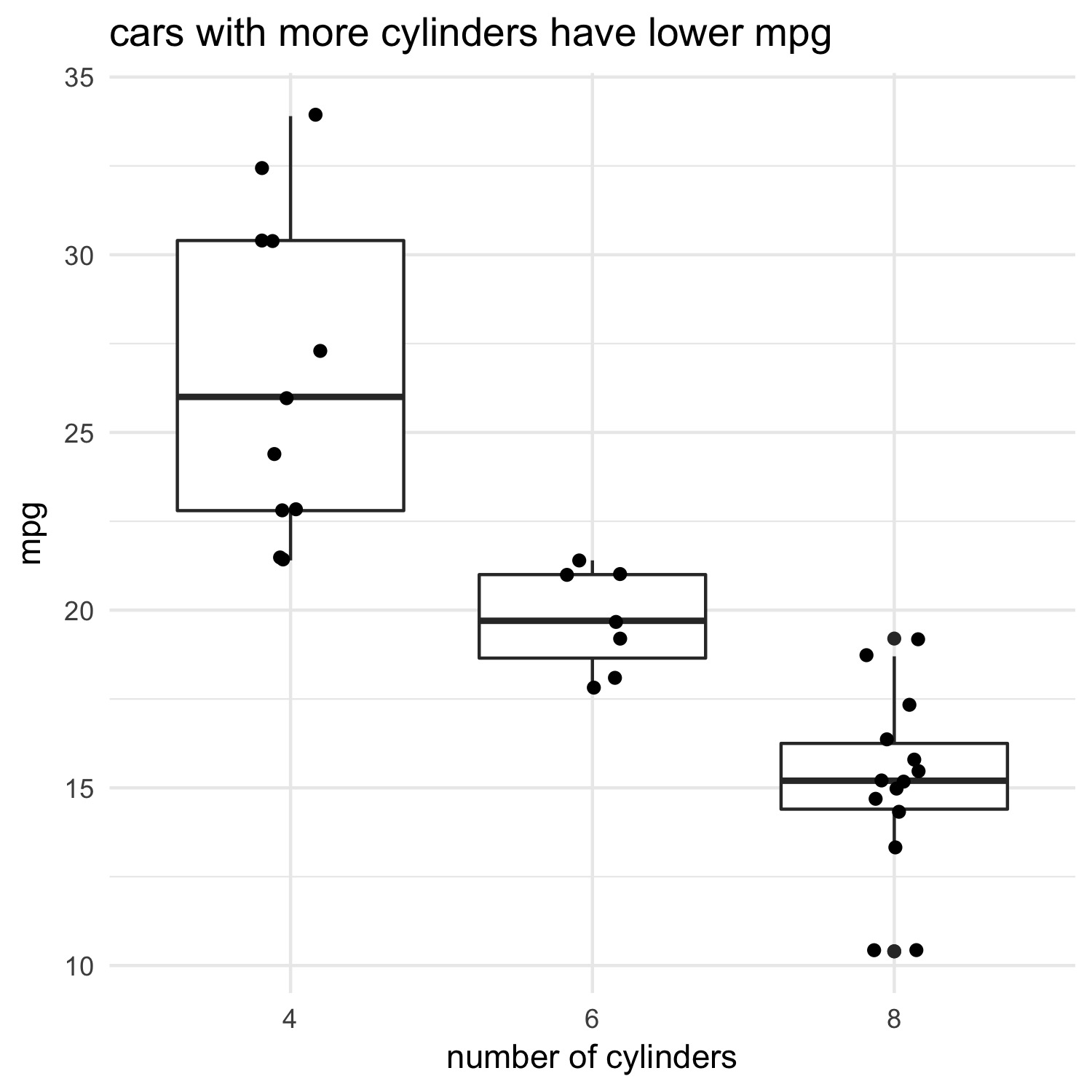
One example where we might use an ANOVA is to test whether cars with different numbers of cylinders vary in their fuel efficiency. The null hypothesis–what we expect if nothing interesting is happening–is that the number of cylinders has no effect on the miles per gallon that the car burns. The alternative hypothesis is that the mean miles per gallon for each group are not all the same.
Let’s first plot this relationship using the mtcars dataset. I’ll follow a practice I’ve been using lately which I call ‘show it; model it’. The idea is to depict some relationship visually, then compute some statistic. This gives me a clear expectation of what the statistics should say before I even compute them:
library(tidyverse)

# show it
ggplot(data = mtcars, aes(x = factor(cyl), y = mpg)) +
  geom_boxplot() +
  geom_jitter(width = 0.1) +
  xlab("number of cylinders") +
  theme_minimal() +
  ggtitle("cars with more cylinders have lower mpg")
Now let’s model it using ANOVA:
# model it
model <- aov(mpg ~ factor(cyl), data = mtcars)
summary(model)
> Df Sum Sq Mean Sq F value   Pr(>F)
factor(cyl)  2  824.8   412.4    39.7 4.98e-09 ***
Residuals   29  301.3    10.4
---
Signif. codes:  0 ‘***’ 0.001 ‘**’ 0.01 ‘*’ 0.05 ‘.’ 0.1 ‘ ’ 1
As expected from the plot, there’s a strong relationship between the number of cylinders in a car’s engine and its fuel efficiency.
Now let’s try a resampling-based approach, which does not make certain assumptions that an ANOVA makes (e.g. the residuals of the models are normally-distributed). I first define a function, get_ss, that takes an ANOVA model as input and returns the between-group sums of squares:
get_ss <- function(model) {
  anova(model)$`Sum Sq`[1]
}
The primary steps are now to:
(a) permute one of the two columns (I chose the cyl column).
(b) run an ANOVA for each of the permutations, from which we can
(c) grab the between-group sums of squares via the function we defined above (note that there are other ways we could have specified how to grab this value; see the map documentation)
set.seed(11) # set the seed for reproducibility

permuted <- permuted <- mtcars %>%
  mutate(cyl = factor(cyl)) %>% # recode `cyl` as a factor
  modelr::permute(999, cyl) %>% # (a)
  mutate(models = map(perm, ~ aov(mpg ~ cyl, data = .))) %>% # (b)
  mutate(between_group_ss = map_dbl(models, get_ss)) # (c)

  head(permuted)
# A tibble: 6 x 4
               perm   .id    models between_group_ss
             <list> <chr>    <list>            <dbl>
1 <S3: permutation>   001 <S3: aov>         53.49394
2 <S3: permutation>   002 <S3: aov>         14.25888
3 <S3: permutation>   003 <S3: aov>         22.42154
4 <S3: permutation>   004 <S3: aov>        190.09011
5 <S3: permutation>   005 <S3: aov>         37.30277
6 <S3: permutation>   006 <S3: aov>         35.29966
The resulting dataframe, permuted, contains the between-group sums of squares for each permuted dataset in the between_group_ss column.
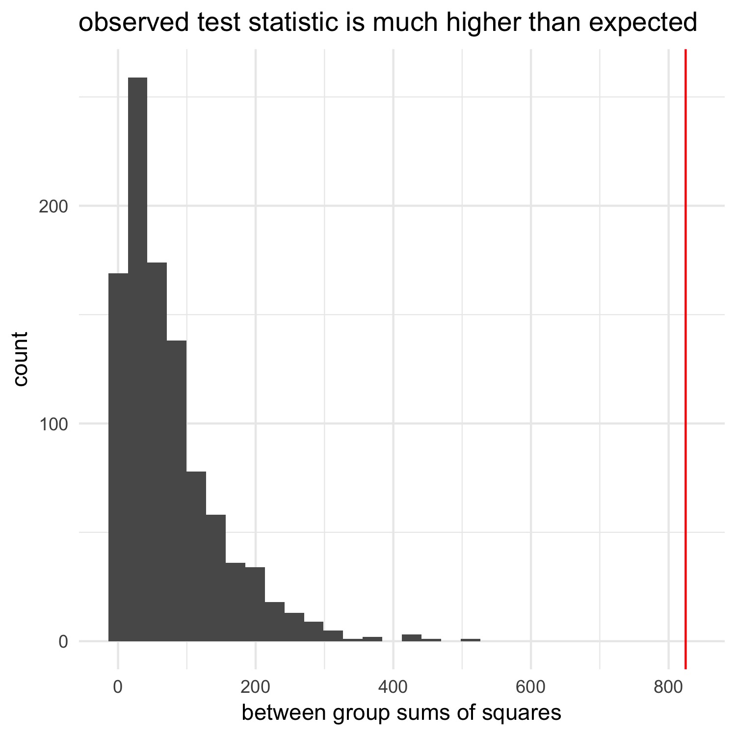
The between_group_ss column represents our null expectation: by permuting the cyl column, we destroyed any relationship between cyl and mpg. We can now compare the between-group sums of squares we observed in the non-permuted data to this null distribution to see how likely it is that we would see a value of between_group_ss as extreme as the one we observed in our data:
# get actual between group SS
observed_ss <- get_ss(model)

# plot null distribution
ggplot(permuted, aes(x = between_group_ss)) +
  geom_histogram() +
  geom_vline(xintercept = observed_ss, color = "red") +
  xlab("between group sums of squares") +
  ggtitle("observed test statistic is much higher than expected") +
  theme_minimal()
We can calculate a p-value in the same way we did in the last post:
# number of permutations
n = 999

(sum(abs(permuted$between_group_ss) > ifelse(observed_ss > 0, observed_ss, -observed_ss)) + 1) / (n+1)
> [1] 0.001
Again, p-values calculated this way can never be 0. We could get a more precise p-value by increasing the number of permutations.
We see that the observed test statistic is far away from what we’d expect if there’s no relationship between the number of cylinders and the miles per gallon, suggesting that there is a relationship. The ANOVA we ran above, as well as the plot we created of the raw data, verify that this make sense.
The approach taken above is very powerful and very general. Instead of permutations of a single dataset, you might be interested in thousands of subsets of a much larger dataset. In both cases, the approach–nesting datasets or models then using mutate in combination with map to go into each dataframe/model and pull something useful out of them–is very handy, and makes plotting with ggplot or using other tidyverse tools a breeze.