replotting three dimensional data
One of my favorite things to do when I read a paper is to replot the author’s data in a way I like better.
Sometimes my reasons are scientific. The bar plot reigns supreme over most academic papers I read, yet bar plots are usually used to hide information from the reader: by distilling a distribution of data into a single number, lots of information is lost. Other times, I just want to see whether I can remake the author’s plots, and if so, how fast I can do it.
But sometimes I come across a figure that I instinctively don’t like and want to come up with a better way of plotting it. Which is what happened in an airport waiting for an outboard flight out east over winter break.
I started reading this paper mostly because one of the authors is in my department and I wanted to see whether they could really use the term behavioural hypervolumes seriously. (They can. Why they don’t say ‘variation in behaviors’ instead is beyond me.) The authors measured the boldness (how long they took to start moving again after being scared), foraging aggressiveness, and overall activity levels of individuals from five spider species.
The authors’ challenge was coming up with a way to present three-dimensional data (the three variables they measured) on a two dimensional page. Here’s the result:
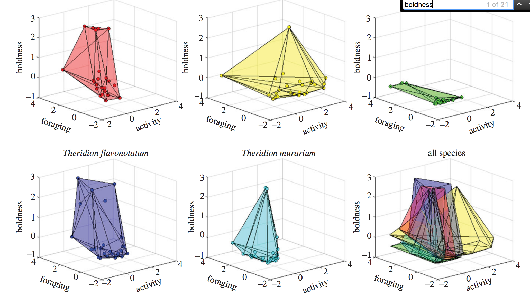
This is the sort of figure I cringe at. In their attempt to show all the data at once, the authors are sacrificing the ability of someone to actually take something meaningful away from the figure. Specifically, it’s difficult for the reader to understand the foraging, activity, and boldness for each of the data points.
Admittedly, you don’t need to know the position in three-dimensional space of each data point to get the point the authors are trying to convey in the paper: the species apparently differ in the ‘volume’ of space occupied if you where to form a shape by connecting the most peripheral data points. Species that have lots of variation in their behaviors will have big ‘hypervolumes’; species where there is little between-individual variation will have small ‘hypervolumes’. Still, it’s really difficult for the reader to judge, for example, the difference in the hypervolume size between the two species in the first column.
Can we plot it better? That’s what I was wondering as a grappled with the Bingo hotspot to download the data from Dryad.
reading in the data
Let’s first go ahead and read in the data. The data were provided as an Excel file; I saved it as a csv, cleaned up some of the column names, and renamed the file.
# load packages
library(tidyverse)
library(magrittr)

# read in data, factoring species
df <- read_csv("~/Downloads/pruitt.csv")
df$species %<>% factor

# scale each variable to enable better visualization
df$activity %<>% scale
df$latency_to_attack %<>% scale
df$latency_to_resume_movement %<>% scale
Note that the %<>% is from the wonderful magrittr package is used to pipe the object on the left-hand side to the function on the right-hand side, and save the result of the function to the original object. x %<>% factor is shorthand for x <- x %>% factor or x <- factor(x)
replot
An obvious first stab is to represent two of the variables by the x- and y-axes and a third by the color of the data points.
ggplot(df, aes(activity, latency_to_attack)) +
  geom_point(aes(color = latency_to_resume_movement)) +
  facet_wrap(~species) +
  scale_color_greens(name = "boldness") +
  theme_mod() +
  add_axes()
(I’m using a ggplot theme I like here, theme_mod, and some helper functions, like add_axes(), that are defined here.)
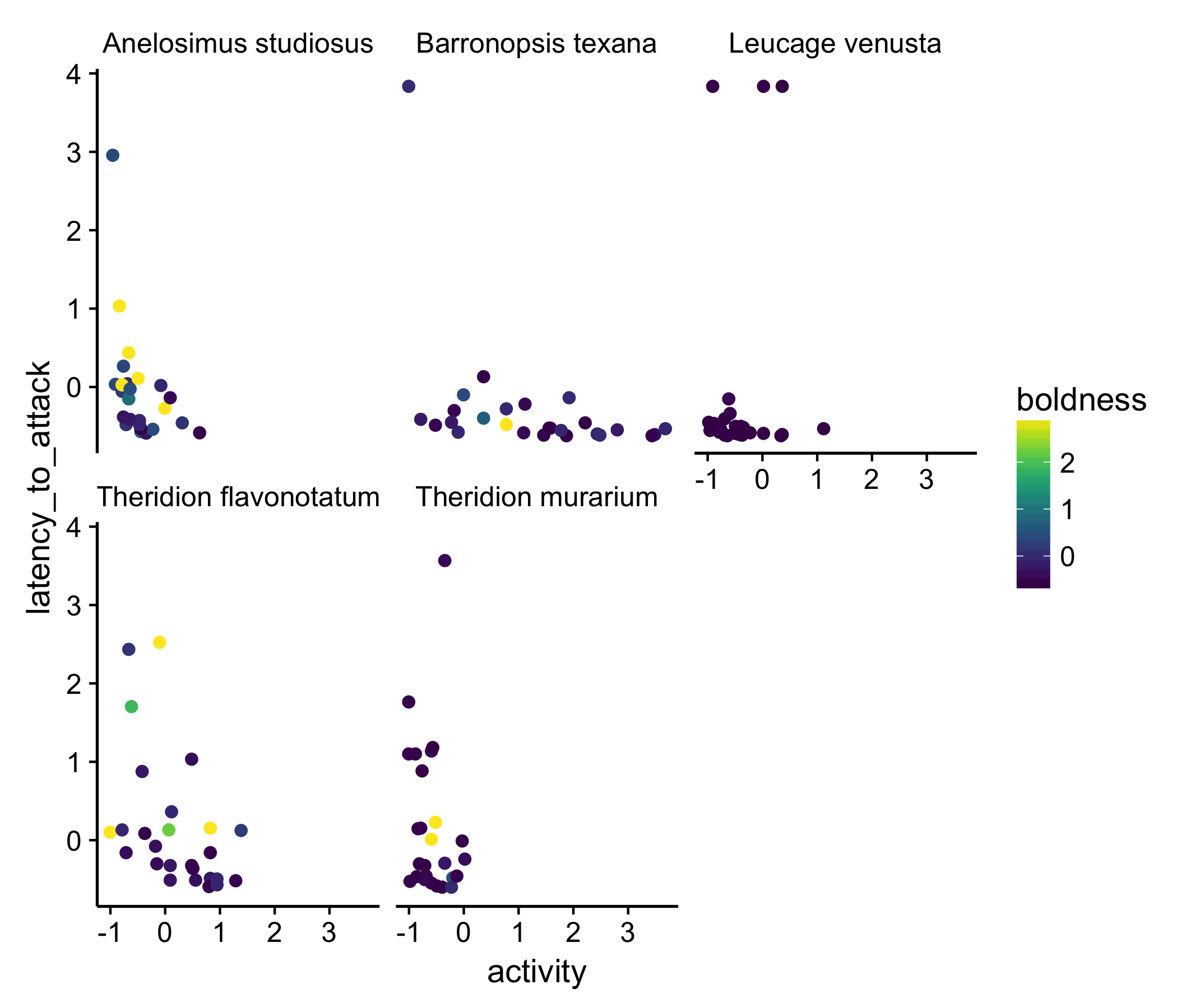
This isn’t the best plot but it shows the data, in, I think, a better way than the three-dimensional plot. Part of what we notice with this presentation is that most of the data points are purple: in other words, most of the spider measured are not very bold. At least to me, this wasn’t clear in the original plot of the data.
a different approach
Is there a better way we can plot these data? This sort of dataset is not uncommon for biologists to want to visualize. One approach people have taken in the past, to better show the relationship between all three variables, is to use a surface plot. Though using a surface plot means we no longer are looking at the data and move to showing some abstraction of summary of the data, they can often be useful.
Below I should how we can use the feilds and akima packages to create a function that returns a surface for each species. This amounts to estimating each species boldness for each combination of activity and latency of attack. I then apply that function to each species in the dataset and plot the result. This turns out to be a lot more readable, shorter, and more efficient than the approach I would have taken a year ago: create five subsets of data (one for each species), generate the surface for each, save each surface as a separate plot, then combine at the end.
First, we define a function that creates the surface for us:
require(fields)
require(akima)
get.inter <- function(df){
  y <- with(df, interp(x = activity,
                  y = latency_to_attack,
                  z = latency_to_resume_movement))
  interp2xyz(y, data.frame=TRUE)
}
Then we using piping to (1) get the surface for each species and (2) plot the results all in one big step
new_plot <- df %>%
  group_by(species) %>% # group by species
  nest %>% # this creates a column, data, with all the data from each of the five species
  mutate(
    inter = purrr::map(data, get.inter) # apply the get.inter() from above to each of the species
    ) %>%
  unnest(inter) %>% # unnest to get back a full data frame with all the results
  ggplot(aes(x = x, y = y)) + # set up out plot
  geom_raster(aes(fill = z)) + # provide a geom to use
  scale_fill_viridis(option = "B", name = "boldness") + # use a perceptually uniform color scheme
  facet_wrap(~species) + # make a separate plot for each species
  theme_mod() + # add a theme
  scale_color_continuous(na.value = "white") + # make NA values white
  labs(x = "activity", y = "foraging") + # add labels
  add_axes() # add axes
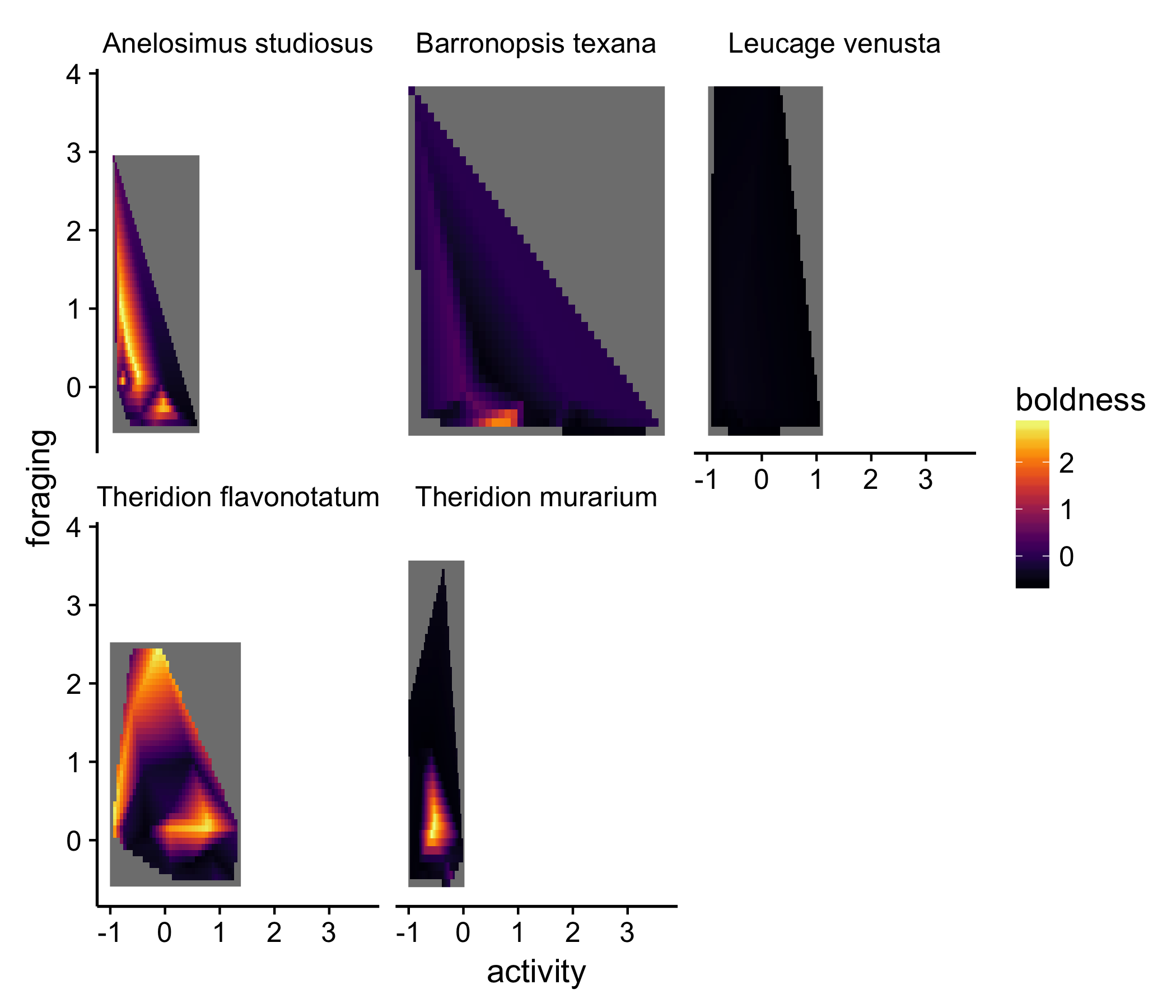
In this presentation, other aspects of the dataset are emphasized. For example, for both the species in the left-most column, there are very bold individuals, but the bold individuals appeared to have different activity and foraging tendencies in the two species. It’s important to note, though, that a lot of these trends are driven by a couple individuals, which the original replot shows. While abstractions like the surface plot are useful, they often hide information. I think it’s actually easier with this type of plot to estimate the difference in ‘hyper volumes’ among the species.
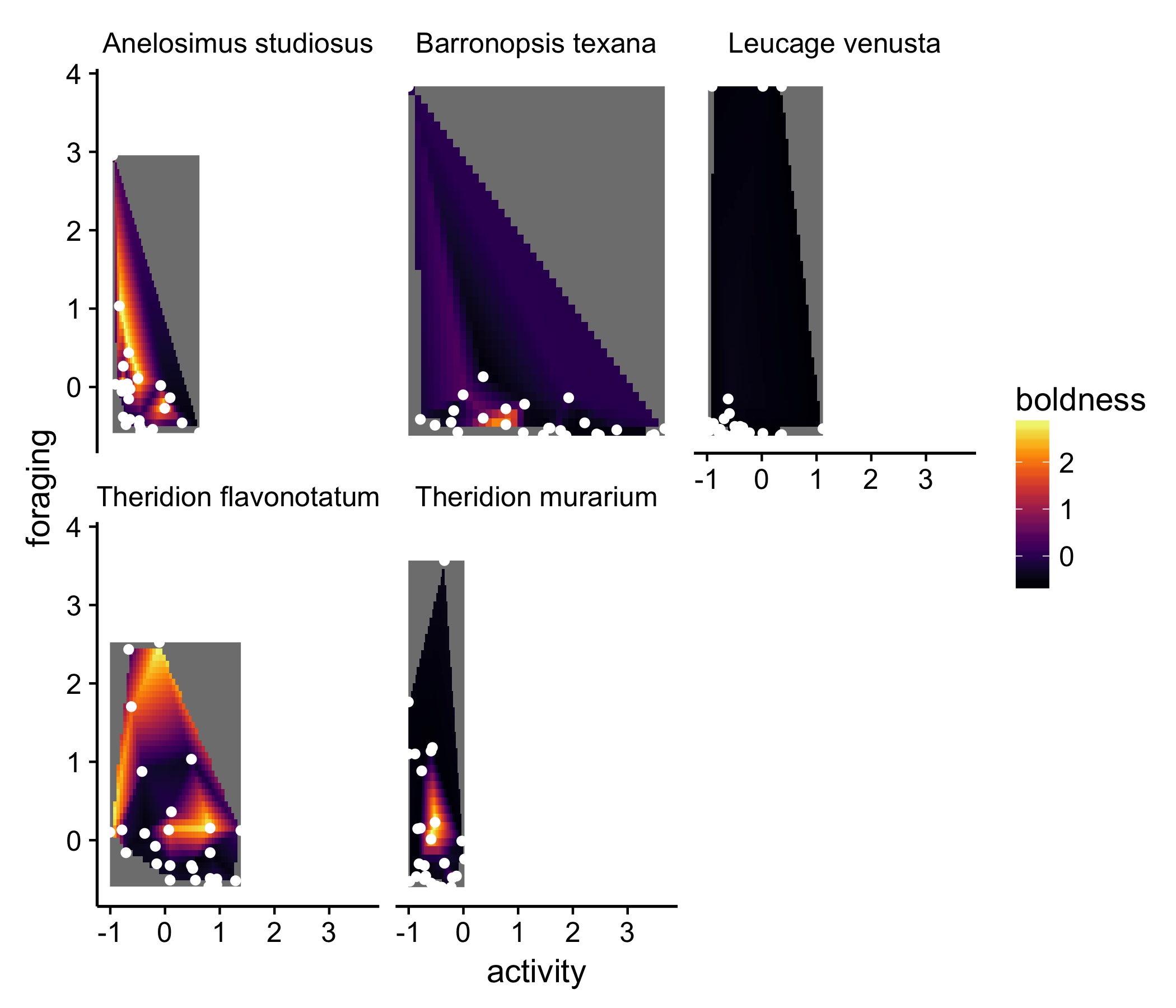
We could improve on this point by actually layering the actual data on top of each of the surface plots. Luckily, ggplot makes this easy:
newplot + geom_point(data = df, aes(x = activity, y = latency_to_attack), color = "white")
but still…
None of these solutions are really satisfying. The goal of the figure is to show that the ‘behavioral hypervolume’ differs between species. None of the above solutions really do that.
The radar plot is, I think, an under-utilized plot type to show multidimensional data, especially when the point of the figure is show how different groups differ in multiple dimensions. There are some whacky ways people have attempted to solve this in the past, but I think radar plots offer a good solution without being too foreign or un-scientific. It’s also a pretty general solution. With a 3D plot like the authors’ chose, you can’t add an additional variable; radar plots can incorporate plenty more variables, and are thus useful for showing all kinds of multidimensional data.
The radar plot is similar to to a parallel coordinate plot, in which each variable gets its own vertical axis, and observations and united by lines. The reader can go left to right, following a given line (observation), comparing the observation with the other points. I often find parallel coordinate plots to be overwhelming, however. Radar plot make things look a little neater by wrapping the parallel coordinate plot around so that it forms a circle instead of a straight line. This adds an extra dimension to the visualization, gives it greater depth, and creates a shape that can be easily compared between categories of observations.
Enough talk: let’s see what these data look like plot in a radar plot. Again, I’m using some helper functions I’ve declaring in a script elsewhere:
df %>%
  mutate(id = 1:nrow(df)) %>% # create a variable that keeps track of observations
  gather(activity:latency_to_resume_movement, key = "character", value = "value") %>% # wide -> long format
  arrange(character) %>% # this is key!
  ggplot(aes(x=character, y=value, group = id, color = factor(species))) + # set up the plot
  geom_line(aes(color = species), size = 1, alpha =0.5) + # draw lines
  geom_point() + # draw points
  scale_color_alpine(guide = F)+ # set the color scheme. This one is based on a beer bottled I liked
  theme_mod() + # change the default theme to something cleaner
  theme(panel.grid.major.x = element_line(), panel.grid.major.y = element_line(color = "grey90")) + # add gridlines back in
  coord_radar() + # add coordinate for radar plot
  facet_wrap(~species) # create a separate plot for each species to make things less chaotic
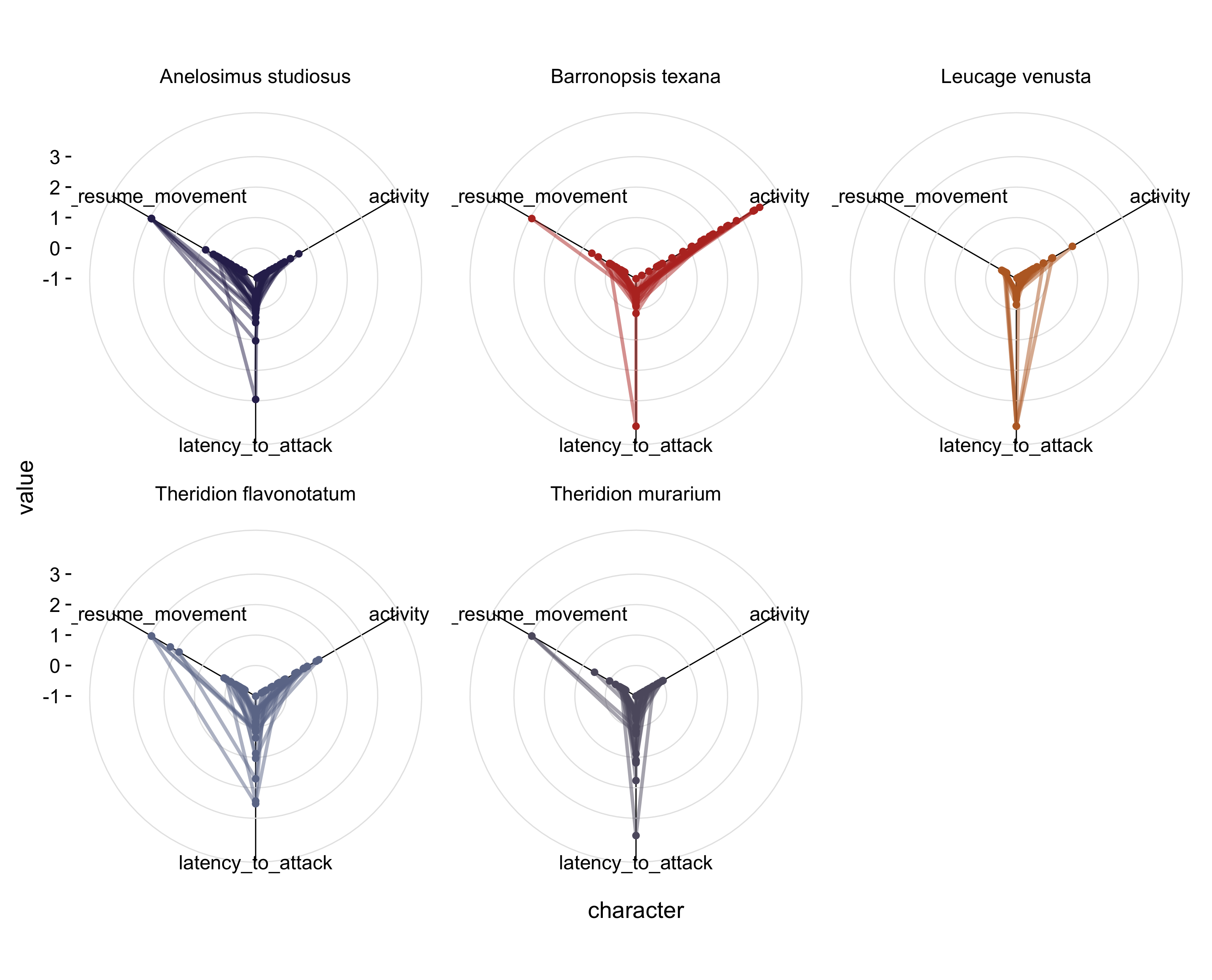
That’s a bit better. Now for each species, we get a sense of the variation in each of the behaviors and can easily compare between species.
But the point of the original figure was really to show that show species have greater ‘hypervolumes’ than other species. Perhaps a simpler way of showing that is to create an average behavioral profile for each species and plot that instead:
df %>%
  group_by(species) %>%  # group by species
  summarise_each(funs(mean)) %>% # create a mean for each species
  mutate(id = 1:nrow(.)) %>% # create an id for each species
  gather(activity:latency_to_resume_movement, key = "character", value = "value") %>% # wide -> long
  arrange(character) %>% # this is key!
  ggplot(aes(x=character, y=value, group = id, color = factor(species))) + # set up the plot
  geom_polygon(aes(fill = species), size = 0.5) + # add the shape
  scale_fill_alpine(guide = F)+ # set the fill
  scale_color_alpine(guide = F) + # set the color
  theme_mod() + # change the theme to something cleaner
  theme(panel.grid.major.x = element_line(), panel.grid.major.y = element_line(color = "grey90")) + # change the gridlines
  coord_radar() + # add a coordinate system for radar plots
  facet_wrap(~species) + # made a separate plot for each species
  labs(x = "behavior", y = "z-score") # make the axis labels clearer
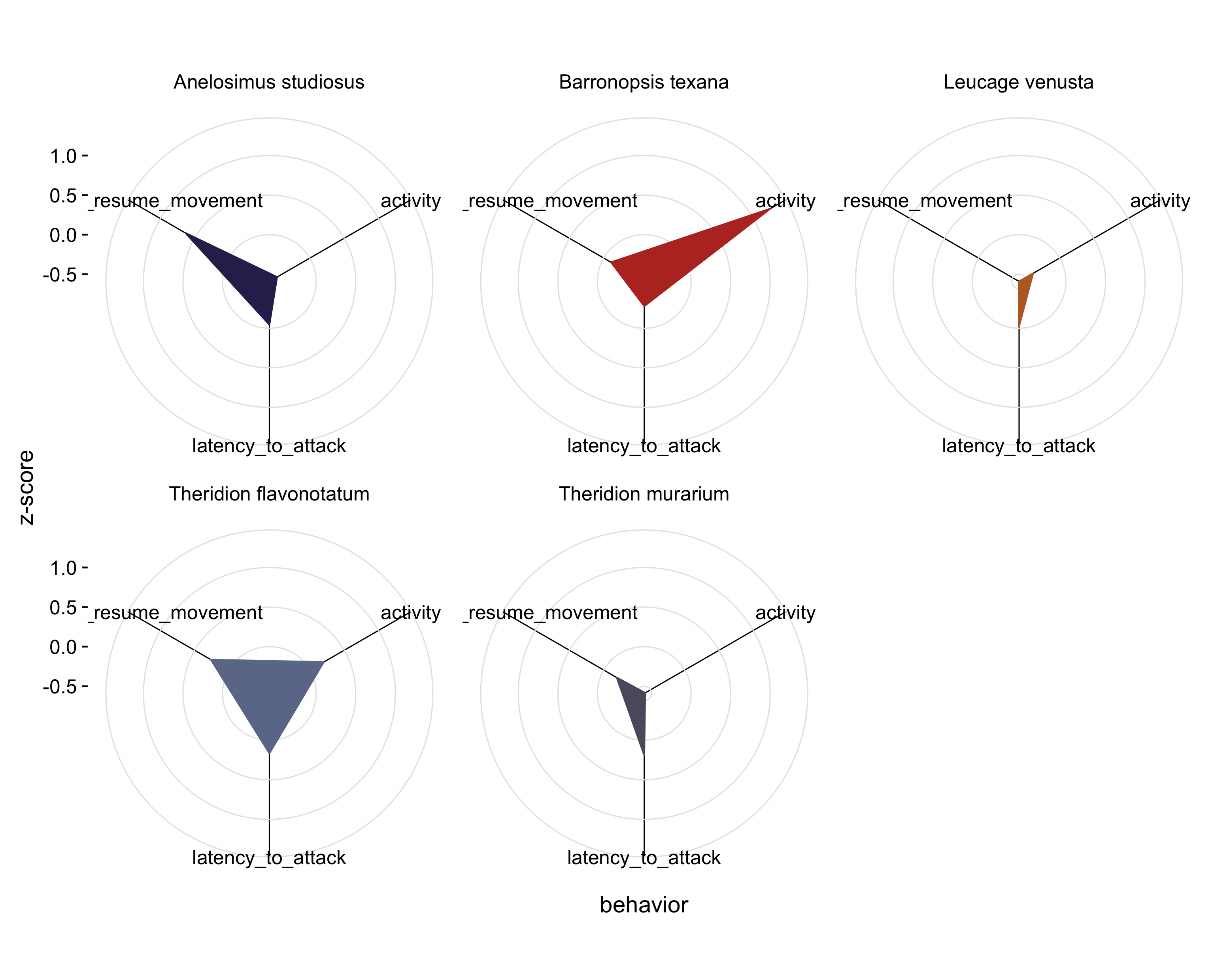
Now, I think the point the authors’ were trying to make comes through a bit better. It’s clear that some species (i.e. Theridion flavonotatum) have a high latency to attack, latency to resume movement, and are fairly active, while other species (i.e. Leucage venusta) show a low latency to attack, low latency to resume movement, and low activity levels. We can see, in two-dimensional space, that the ‘behavioral hypervolumes’ of the species differ. This plot could even be improved by inverted the latency metrics so that larger values correspond with more extreme or bolder spiders, instead of larger values (= large latencies) being relatively shy spiders.
take-aways
- 3D plots often seen like a neat idea; they are rarely practical
- try plotting your data several ways before deciding on a presentation
- focus on what the story you want to tell or the main point of a figure is
- radar plot are a useful technique to plot multivariate data