a couple recipes for exploratory data visualization in R
Everyone knows that visualization is key to understanding a dataset. But all too often, I feel like I get too involved in analyzing the dataset before actually seeing what the raw data look like.
In Python, pandas makes this pretty easy:
import pandas as pd
import matplotlib.pyplot as plt

df = pd.read_csv("/path/to/some/file.csv")
df.plot()
plt.show()
In R, ggpairs, as well as graphics::pairs, perform similar functions. The problem with ggpairs is that if you have a data frame with more than a few variables the result is criminally complex, because for n variables n^2 graphs are produced. Often, I want to focus on the distribution of each variable by itself instead of looking at each pairwise relationship between each of the variables, which can get exhausting quickly. This also means only producing n plots, which has a positive effect on my sanity.
Below I show a couple recipes and functions that others might find useful for quickly getting a sense of your data after reading it in. First I show how to plot the distribution of all numeric variables in a dataset. Second I show how to explore the relationship between some categorical variable and each of those numeric variables.
plotting histograms for all numeric variables
First let’s grab some data and load the tidyverse:
library(tidyverse)

# data from DOI: 10.1098/rsbl.2016.0467
df <- read_csv("http://datadryad.org/bitstream/handle/10255/dryad.121150/Bolnick_data.csv?sequence=2")

# view the variables and their types
map_chr(df, typeof)
                        Lake                          Fish
                  "character"                   "character"
                  Model_color                         depth
                  "character"                     "integer"
                      N_bites                    N_inspects
                    "integer"                     "integer"
      Aggressive_interactions                          Date
                    "integer"                   "character"
  Mean.interval.between.bites Median.interval.between.bites
                     "double"                      "double"
                  SD.interval
                     "double"
These data describe how male sticklebacks respond to simulated intruder attacks in the wild in two lakes.
To look for outliers and get a sense of how each variable might be skewed, I define a simple function, plot_histograms():
plot_histograms <- function(data){
  data %>%
    select_if(is.numeric) %>%
    gather(variable, value) %>%
    ggplot(aes(x = value)) +
    geom_histogram() +
    facet_wrap(~variable)
}
plot_histograms(df)
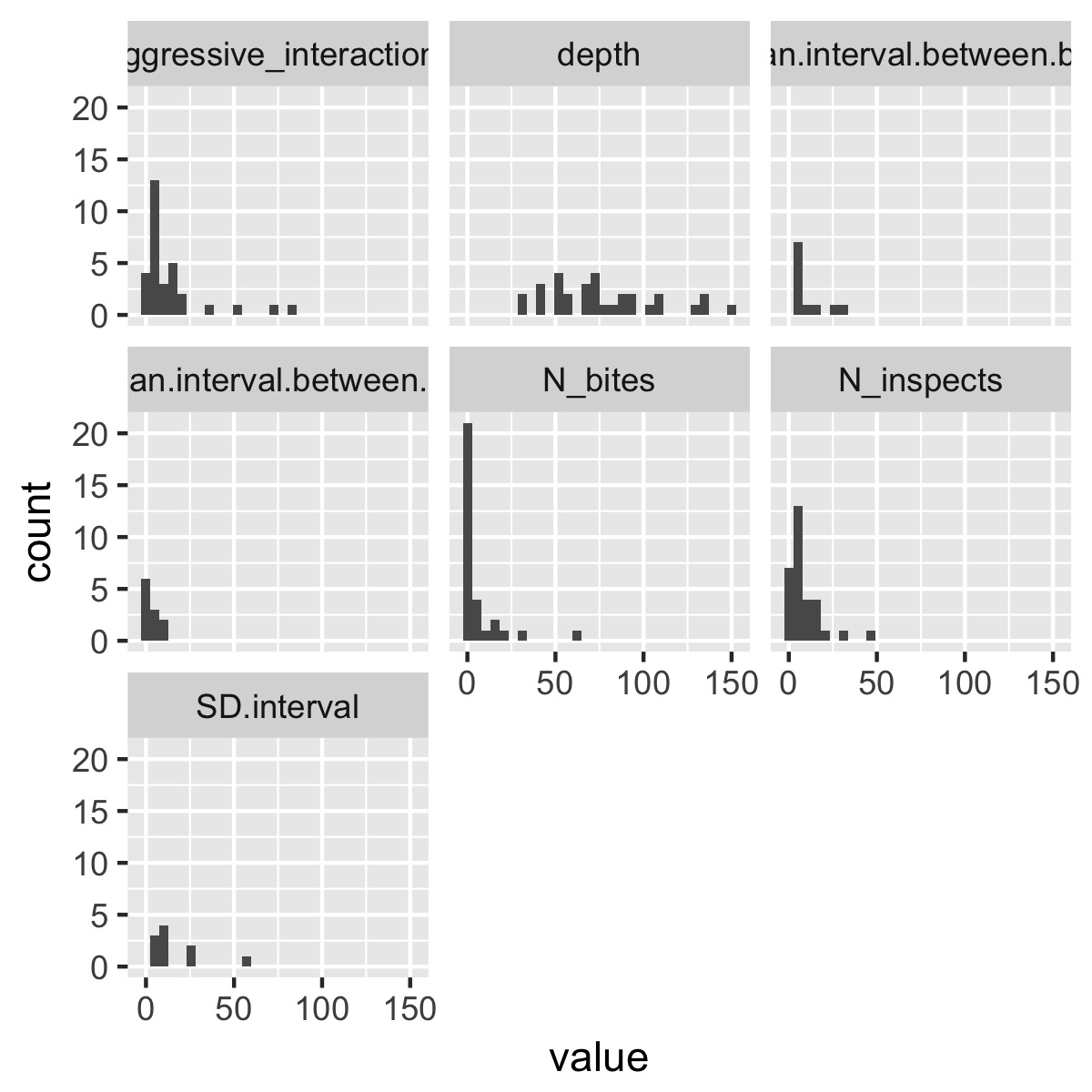
This selects only the numeric columns from the data frame, puts the data into tidy format, then uses facet_wrap(~variable) to produce a different plot for each variable. (If the variables are on very different scales, it might make sense to use facet_wrap(~variable, scales = "free_x")). You could obviously make this function a lot fancier and more flexible, but it produces a plot that’s informative without being overwhelming as is.
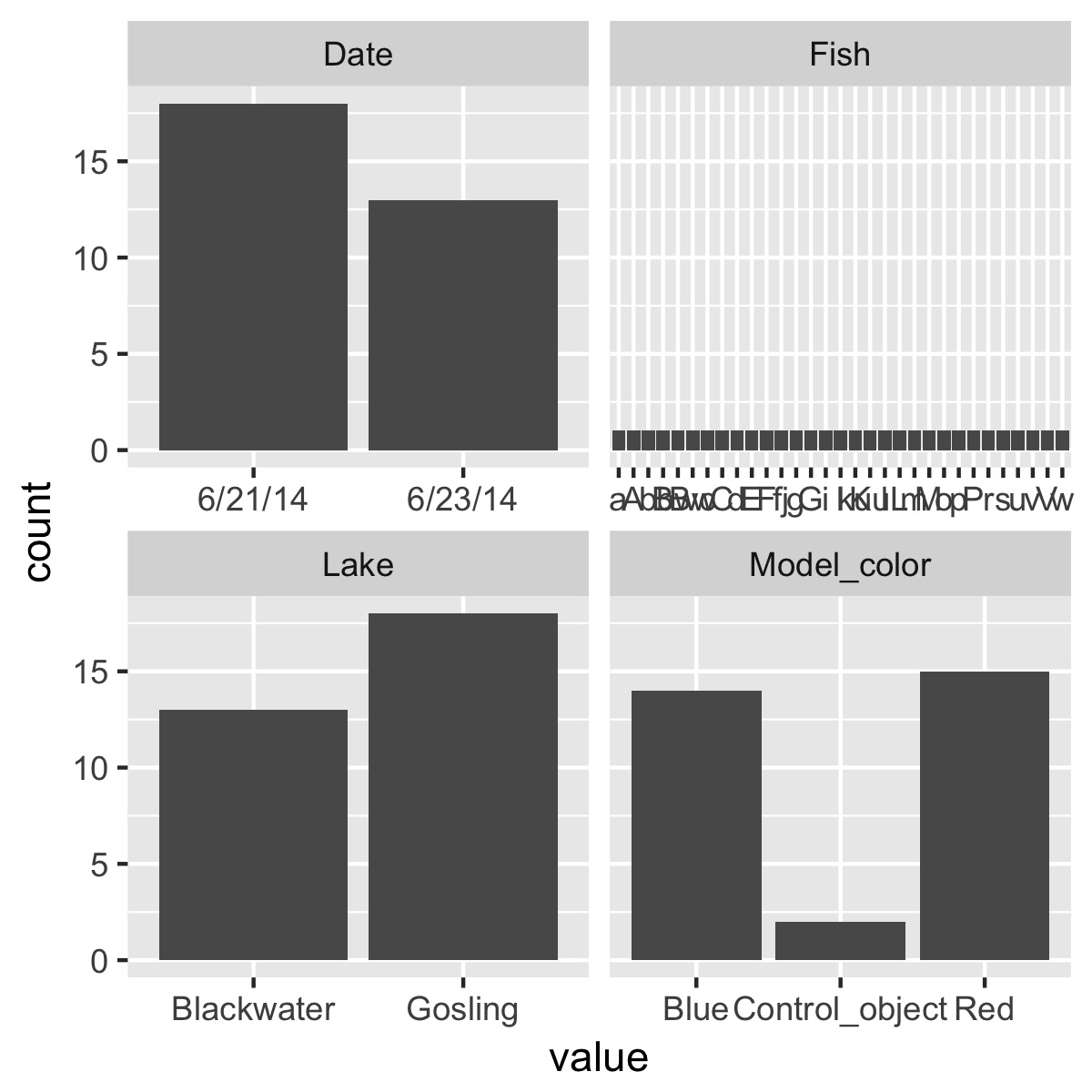
We could use the same logic to just look at counts of the categorical variables:
plot_counts <- function(data){
  data %>%
    select_if(is.character) %>%
    gather(variable, value) %>%
    ggplot(aes(x = value)) +
    geom_bar() +
    facet_wrap(~variable, scale = "free_x")
}
plot_counts(df)
plot the relationship between a categorical variable and each numeric variable
To take it one step further, we’re probably interested in getting a first-pass look at the relationship between the numeric variables and each of the categorical variables. Again, ggpairs does this already, but depending on the number of variables, it throws in a lot of extra information that can be difficult for a human brain to process.
Below I define plot_cat_relationship(), which is similar to plot_histograms(); instead of producing a histogram for each numeric variable, however, it produces a boxplot of the relationship between each numeric variable and one categorical variable. This keeps things simple enough for my head to process things.
The implementation gave me a chance to learn more about tidyeval and quosures, because the function relies on tidyverse packages like dplyr that use tidyeval. Interested readers should read the article linked above, which does a really nice job of explaining tidyeval.
ggplot2 does not use tidyeval yet, however, which leads to some ugly workarounds in the code below.
plot_cat_relationship <- function(data, categorical_variable) {

  numeric_cols <- names(data)[map_lgl(data, is.numeric)]
  enquo_cat <- enquo(categorical_variable)

  data %>%
    select(!!enquo_cat, numeric_cols) %>%
    gather(variable, value, -!!enquo_cat) %>%
    ggplot(aes_string(x = quo_name(enquo_cat), y = "value", color = quo_name(enquo_cat))) +
    geom_boxplot() +
    facet_wrap(~variable) +
    coord_flip() +
    scale_color_brewer(type = "qual", palette = "Dark2", guide = F)
}

# note that `Model_color` is not in quotes
plot_cat_relationship(df, Model_color)
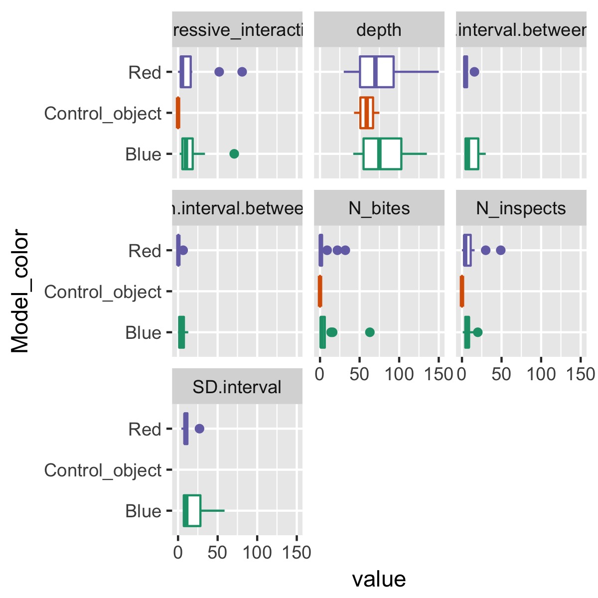
This makes it easy to see how a single categorical variable, Model_color, differs among each of the variables.
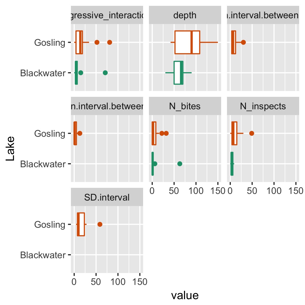
We also might be interested in quickly assessing whether there are big differences between lakes:
plot_cat_relationship(df, Lake)
summary
- Writing functions to automate tasks you should perform more regularly makes those tasks easier to do, and thus increases the likelihood that you’ll actually do the task
- Creating plots with
ggplot2works pretty seamlessly in functions - Using functions from other
tidyversepackages that use tidyeval can be a little tricky, but with a little practice they can be naturally incorporated into functions and used for programming