adding marginal plots with cowplot
Perspective is often something missing from data analysis. We’re using to looking at a plot and thinking we understand some dataset. But most data presentations are made from a single perspective. They’re biased: they’re made by someone who has some idea, theory, or point of view they want to communicate. They’re like unreliable narrators in fiction: they have some motive, some point of view they want to get across, and you shouldn’t trust them at face value.
In order to really grasp a dataset, I find it necessary to look at the data in more than one way.
One easy way to get yourself in the habit of viewing a dataset in multiple ways is by plotting marginal distributions. This is common when you want to represent the relationship between two quantitative variables on a scatterplot. The scatterplot’s function is to show a relationship; it requires too much cognitive investment to understand just one variable to at a time. One solution is to add plots to each side of the scatterplot to show the marginal distribution of each variable. In addition to the relationship between the two variables, the distibution of both variables is also now obvious to the reader. Marginal plots can encourage insights about both variables separately.
The problem is that there aren’t intuitive ways to add marginal plots in R, especially when using the dominant plotting package for R, ggplot2. There are some solutions, like ggExtra, but the APIs used are awkward and not in keeping with ggplot’s style. They also aren’t flexible enough for complex plots and for those who want to customize their plots precisely.
One solution now comes in Claus Wilke’s cowplot. A new series of functions provide an easy way to add marginal plots. Below I show a series of examples.
Note that running the code below requires the GitHub version of cowplot (as of commit a0b419e9579d4edee7e7f83334f28aedb745de52), not the version currently on CRAN. All the code shown below is available on Github here.
the approach
cowplot’s design for how it adds marginal plots is quite general and easy to understand. The basic steps:
(1) Save your base plot that you’d like to add marginal plots to as an object.
(2) Use axis_canvas() to tell cowplot what axis you want to create a marginal plot for; then create the plot like you would for any other ggplot (except without the explict call to ggplot()).
(3) Combine the original and marginal plot using insert_yaxis_grob() for y-axis marginal plots and insert_xaxis_grob() for x-axis marginal plots.
(4) ggdraw() your plot.
Let’s look at some examples:
examples
I’ll be using data from a paper on African starlings you can find here. (For purposes of this demo, we ignore the fact that species are not independent data points.)
library(tidyverse) # for ggplot2
library(magrittr) # for pipes and %<>%
library(ggpubr) # for theme_pubr()

# to install:
# devtools::install_github("wilkelab/cowplot")
library(cowplot)
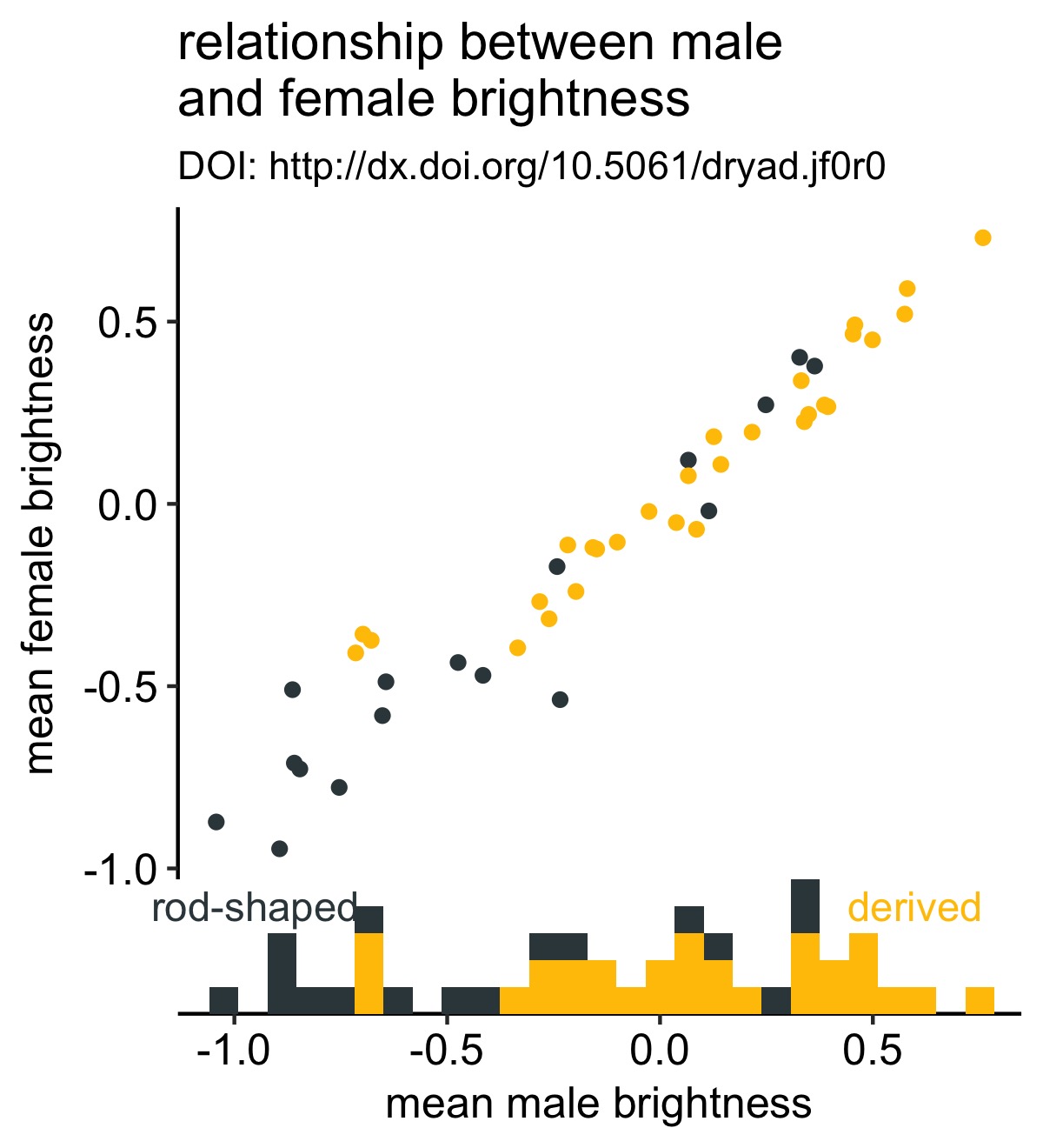
We’ll start by creating a simple plot between male and female mean plumage brightness. To make things slightly more interesting, we’ll color the points according to whether melanosomes—the organelles that produce plumage color—are rod-shaped or derived.
Below I download the data directly from Dryad, perform some basic cleaning of the data, then create the plot:
# read in the dataframe
df <- read_csv("http://datadryad.org/bitstream/handle/10255/dryad.112898/traitdata.csv?sequence=1")

# create more useful names for the melosome variable
df %<>% mutate(melano = factor(melano), melano = forcats::fct_recode(melano, "derived" = "1", "rod-\nshaped" = "0"))

# create the plot
original_plot <- df %>%
  ggplot(aes(x = male.meanB, y = fema.meanB)) +
  geom_point(aes(color = melano)) +
  theme_pubr() +
  scale_color_manual(values = c("#37454B", "#F2C500")) +
  labs(x = "male mean brightness", y = "female mean brightness", title = "relationship between male\nand female brightness", subtitle = "DOI: http://dx.doi.org/10.5061/dryad.jf0r0")

original_plot
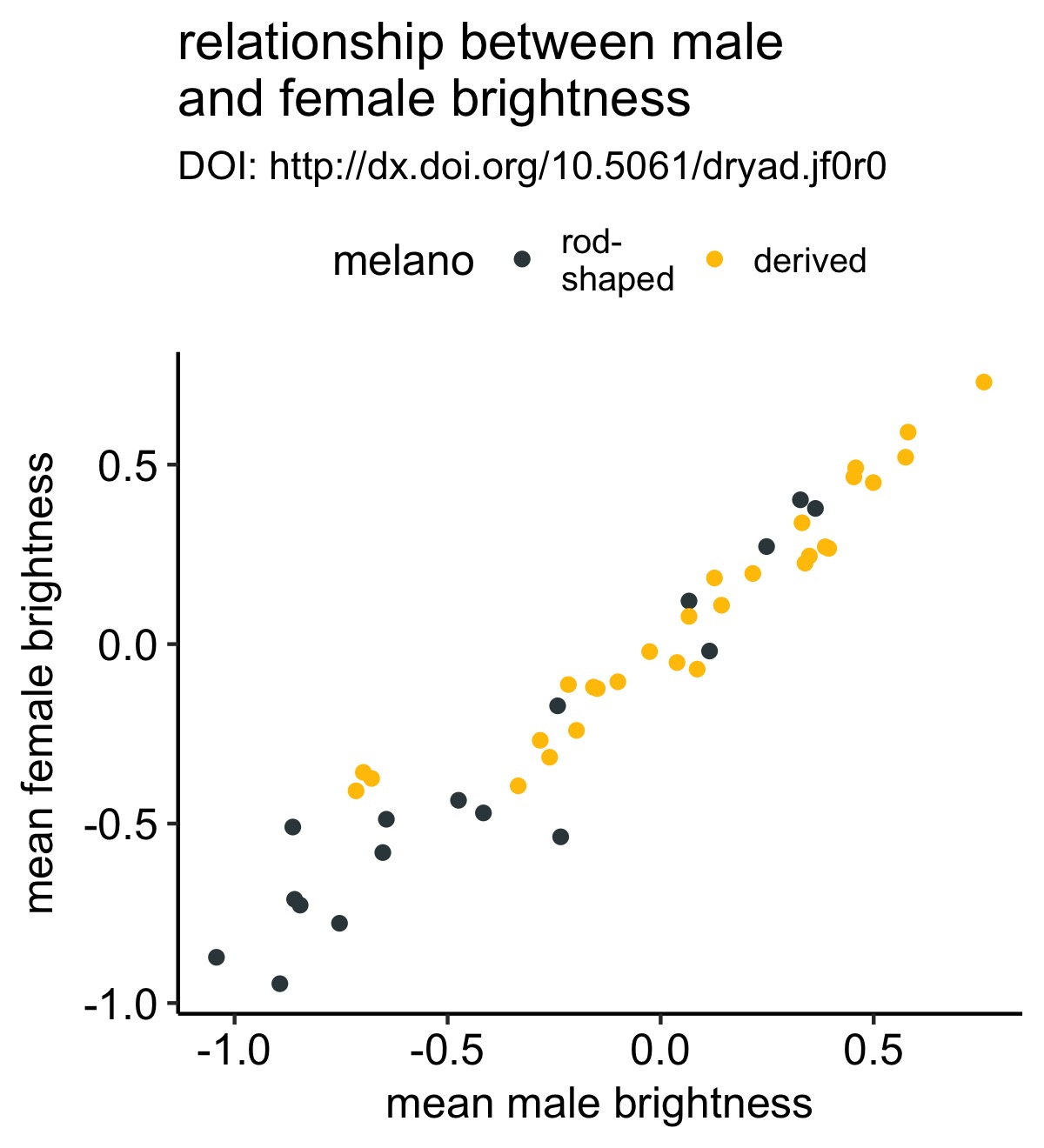
This is a simple scatterplot with the points colored according to whether each bird species has rod-shaped or derived melanosomes.
Let’s improve this plot by adding a marginal histogram to the bottom of the plot so that we aren’t distracted by the obvious positive correlation in the scatterplot and can focus on whether rod- or derived-species have greater male brightness values:
# create the histgram for the x-axis with axis_canvas()
xhist <- axis_canvas(original_plot, axis = "x") +
  geom_histogram(data = df, aes(x = male.meanB, fill = melano)) +
  scale_fill_manual(values = c("#37454B", "#F2C500"))

# create the combined plot
combined_plot <- insert_xaxis_grob(original_plot, xhist, position = "bottom")

# plot the resulting combined plot
ggdraw(combined_plot)
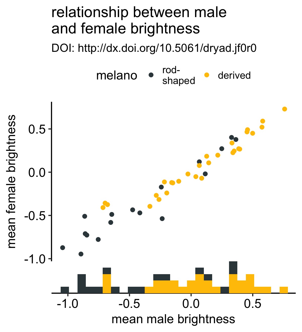
This was very few lines of code and now we have a strikingly more mature-looking figure. It’s now a bit more obvious to the viewer that males from species with derived melanosomes are brighter.
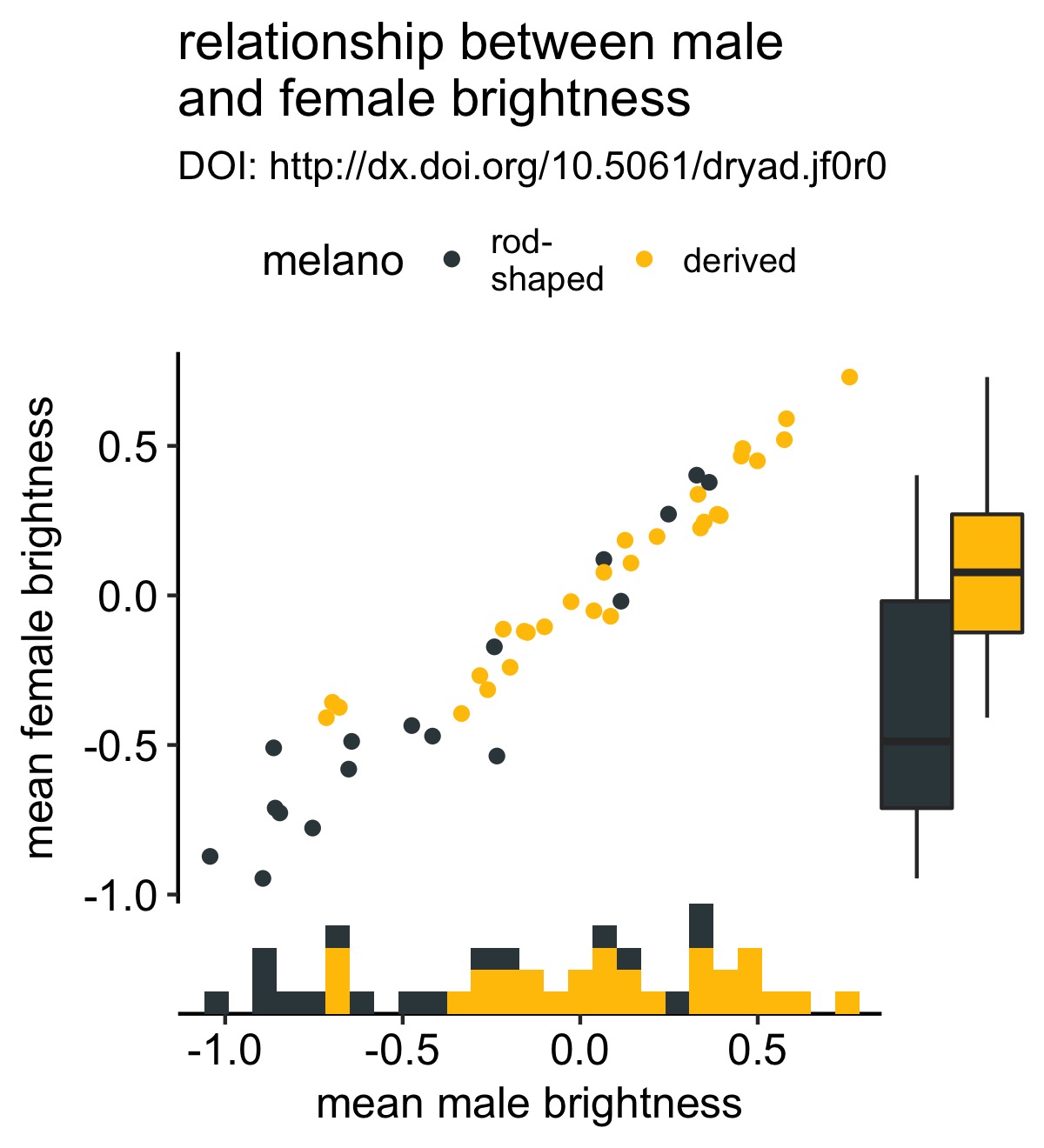
We can do the same for the y-axis. Instead of using a histogram, I’ll use a boxplot:
# create the marginal boxplot for the y-axis
y_box <- axis_canvas(original_plot, axis = "y") +
  geom_boxplot(data = df, aes(x = 0, y = fema.meanB, fill = melano)) +
  scale_fill_manual(values = c("#37454B", "#F2C500"))

# create the combined plot
combined_plot %<>% insert_yaxis_grob(., y_box, position = "right")

# show the result
ggdraw(combined_plot)
I accidently discovered that you can keep adding these marginal plots if you wish. I’m not sure that this is a good idea, but it’s good to know. Below I add a density plot to the y-axis:
y_density <- axis_canvas(original_plot, axis = "y", coord_flip = TRUE) +
  geom_density(data = df, aes(x = fema.meanB,fill = melano), color = NA, alpha = 0.5) +
  scale_fill_manual(values = c("#37454B", "#F2C500")) +
  coord_flip()

# create the combined plot
combined_plot %<>% insert_yaxis_grob(., y_density, position = "right")

# show the result
ggdraw(combined_plot)
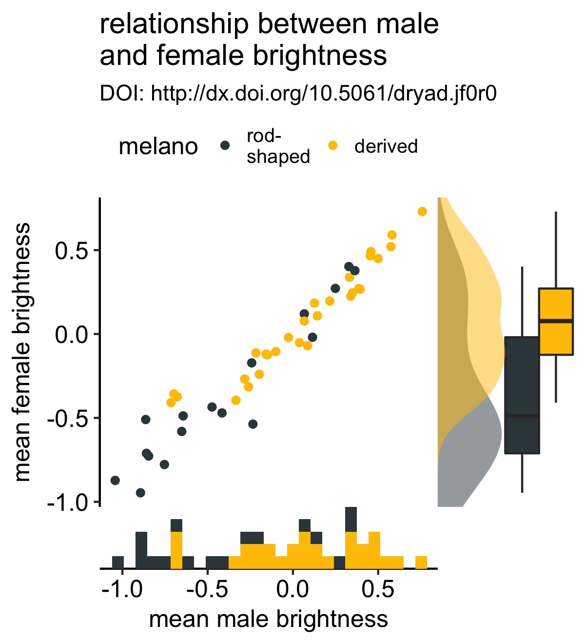
Note that there’s a little extra magic happening here. In particular, there’s a (relatively new) coord_flip argument.
Thanks to some prodding by @lpreding, the code for marginal density plots is now even simpler and cleaner. #rstats #ggplot #cowplot pic.twitter.com/mu0r9GkTKH
— Claus Wilke (@ClausWilke) August 24, 2017
This argument allows you to use coord_flip() in your marginal plots and clones the correct axis. Previously if you used coord_flip() when defining one of the marginal plots, the wrong axis was cloned. Setting coord_flip = TRUE lets cowplot know that you’re using coord_flip() when defining your marginal plot and clones the correct axis. This allows the use of a wider variety of geoms than in the previous implementation.
We can improve our figure by removing the legend—which I love to get rid of if I can—and add labels to the histogram:
# add labels to the histogram
xhist <- axis_canvas(original_plot, axis = "x") +
  geom_histogram(data = df, aes(x = male.meanB, fill = melano)) +
  geom_text(data = data.frame(x = c(0.6, -0.95), y = c(4, 4), melano = c("derived", "rod-shaped")), aes(x = x, y = y, label = melano, color = melano), size = 4) +
  scale_color_manual(values = rev(c("#37454B", "#ffc300"))) +
  scale_fill_manual(values = c("#37454B", "#ffc300"))

combined_plot <- insert_xaxis_grob(original_plot + theme(legend.position="none"), xhist, position = "bottom")

ggdraw(combined_plot)
Now it’s clear what the colors represent without having to refer to the legend.
Also note that it’s very easy to change the size of the marginal plot with width or height argument to insert_yaxis_grob or insert_xaxis_grob, respectively.
extensions
The general design approach here lends itself to some extensions, as Claus has previously shown. As an example, we can add labels directly to lines, again making rendering the legend obsolete.
[Note that there are other solutions to this; ggrepel and directlabels come to mind.]
# create a line plot
# for simplicity I do not add in the data points
line_plot <- df %>%
  ggplot(aes(x = male.meanB, y = fema.meanB)) +
  geom_smooth(aes(color = melano), se = F) +
  theme_pubr() +
  scale_color_manual(values = c("#37454B", "#F2C500"), guide= F) +
  labs(x = "male mean brightness", y = "female mean brightness", title = "relationship between male\nand female brightness", subtitle = "DOI: http://dx.doi.org/10.5061/dryad.jf0r0")

# add labels
y_labels <- axis_canvas(line_plot, axis = "y") +
  geom_text(data = df %>% group_by(melano) %>% summarise(max_female = max(fema.meanB, na.rm = T)), aes(x = 0, y = max_female, color = melano, label = melano)) +
  scale_color_manual(values = c("#37454B", "#F2C500"))

# make combined plot
combined_plot <- insert_yaxis_grob(line_plot, y_labels, position = "right")
ggdraw(combined_plot)
Note the argument to geom_text():
df %>% group_by(melano) %>% summarise(max_female = max(fema.meanB, na.rm = T))
Here I’m retreiving the maximum brightness value for each type of melanosome and using that as my y-axis coordinate. That way the label is in line with the maximal observation.
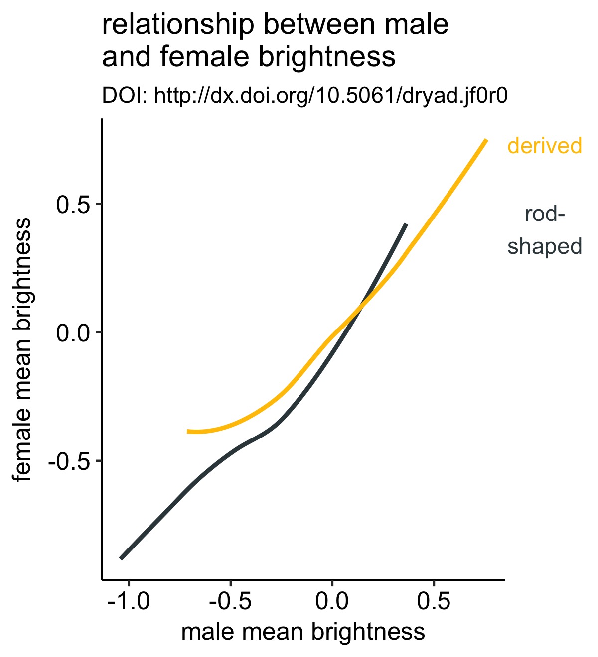
Note that there are other ways to do this, but this is approach is sufficently general to work in a lot of use cases (esp. when all the lines extend to the end of the x-axis).
take-aways
- marginal plots can reveal aspects of your dataset not previously considered
cowplotprovides a general and easy solution for adding marginal plots