rise of the PIs
‘Collaboration’ is a big buzz word in science. Working with other labs spreads ideas, encourages more perspectives on a single problem, and spreads money around to more places than it would be otherwise.
But is there evidence that PIs (principle investigator; think: professor) are working together more?
rise of the PIs
I recorded the number of PIs and co-PIs on all NSF grants awarded from 1975 - 2015. I’m focusing on these years because the data is clearest and most robust.
From a previous blog post, I’ve created a dataframe called df in R that contains the columns:
> library(tidyverse)
> library(magrittr)
> library(stringr)

> names(df)
[1] "file_name"       "directorate"     "division"        "title"
 [5] "institution"     "amount"          "grant type"      "abstract"
 [9] "date_start"      "date_end"        "program_officer" "investigators"
[13] "roles"           "number_pis"      "duration"
The main things I’ll be focusing on today are directorate (roughly, the type of science that is being funded, like biology or physics) and number_pis, the number of PIs / co-Pis on a grant.
Because doctoral dissertation improvement grants, or DDIGs, are non-standard grants, I’m going to exclude them from this analysis. I’m also going to pull out the year the grant was set to begin and clean up the directorate names by removing the ‘Directorate for’ or ‘Direct for’ that prefaces each directorate:
> df %<>%
  mutate(is_ddig = str_detect(title, "Dissertation Research:"),
         year = lubridate::year(date_start),
         directorate = directorate %>% as.character %>% str_replace_all(., "Direct For ", "") %>% str_replace_all(., "Directorate for ", ""))
We can ask whether the average number of PIs on grants has increased over time by grouping by the year and the directorate, calculating the average number of PIs for each year/directorate, and plotting with ggplot:
> df %>%
  group_by(year, directorate) %>% # set grouping variables
  summarise(avg_pis = mean(number_pis, na.rm = T), n = n()) %>% # get the average number of PIs by year/directorate
  filter(year > 1975 & year < 2016, is_ddig == F) %>% # only choose quality years; exclude DDIGs
  ggplot(aes(x = year, y = avg_pis)) +
  geom_line(aes(color = directorate), size = 1) + # add lines for each directorate
  scale_color_world() + # change colors
  ggtitle("average number of PIs on a grant has increased") + # add title
  ylab("average # PIs") + # change y axis label
  theme_pubr() + # change theme
  theme(legend.position="right")
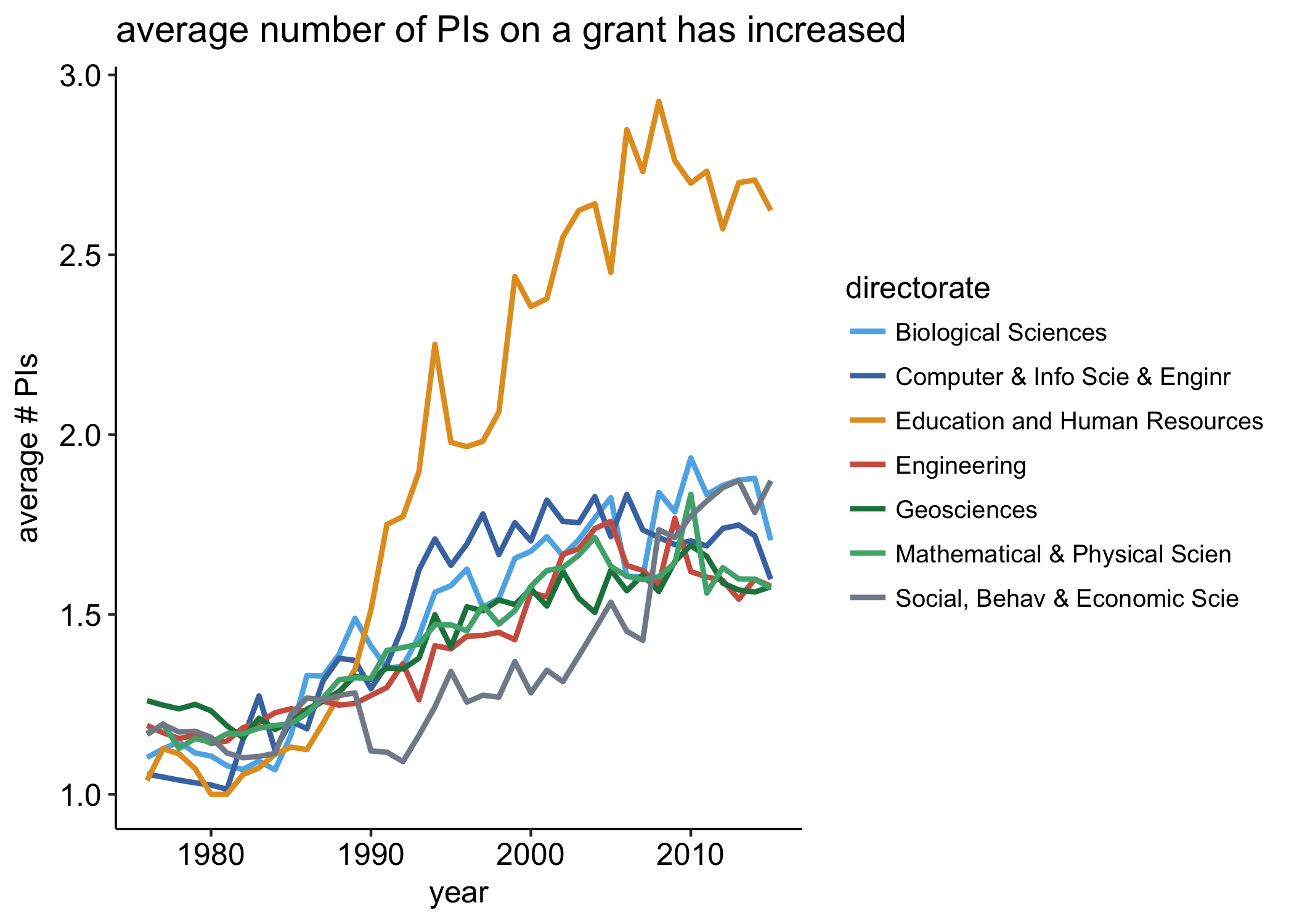
So overall, it looks like yes, the number of PIs on NSF has increased over time.
In the late 1970s, most directorates awarded grants that had a single PI on it. Since then, we see a slow but steady increase in the average number of PIs on NSF grants. The real outlier is grants in Education and Human Resources directorate: around 1990, the number of PIs explodes, reaching an average grazing three PIs / grant in the late 2000s. I’m not sure why this is but it’s an interesting finding nonetheless.
using lsmeans
I like asking a question a few different ways before I’m satisfied with an answer. Below I use the lsmeans package to average the number of PIs across (a) years and (b) directorates. This is a great package that allows you to estimate and, in combination with broom, plot estimated marginal means.
We first have to define a model. This is a dead simple linear model—because this is mainly just for visualization, I’m not bothering to run though all the diagnostics I would normally run:
> library(lsmeans)
> model <- lm(number_pis ~ directorate + factor(year), data = df %>% filter(year >1975 & year < 2016, is_ddig == F))
Now I can use lsmeans in conjunction with broom::tidy to easily plot the estimates marginal means across all directorates in each year:
> lsmeans(model, "year") %>% # specify that we want to look across years
  tidy %>% # turn the result into a dataframe
  ggplot(aes(x = year, y = estimate)) +
  geom_point() + # add points
  geom_line() + # add line
  ggtitle("average number of PIs over time", subtitle = "averaged across all directorates") + # add title
  ylab("model-averaged number of PIs") + # change y axis label
  geom_errorbar(aes(ymin = estimate - std.error, ymax = estimate + std.error), width = 0) + # add standard deviation
  theme_pubr() # change theme
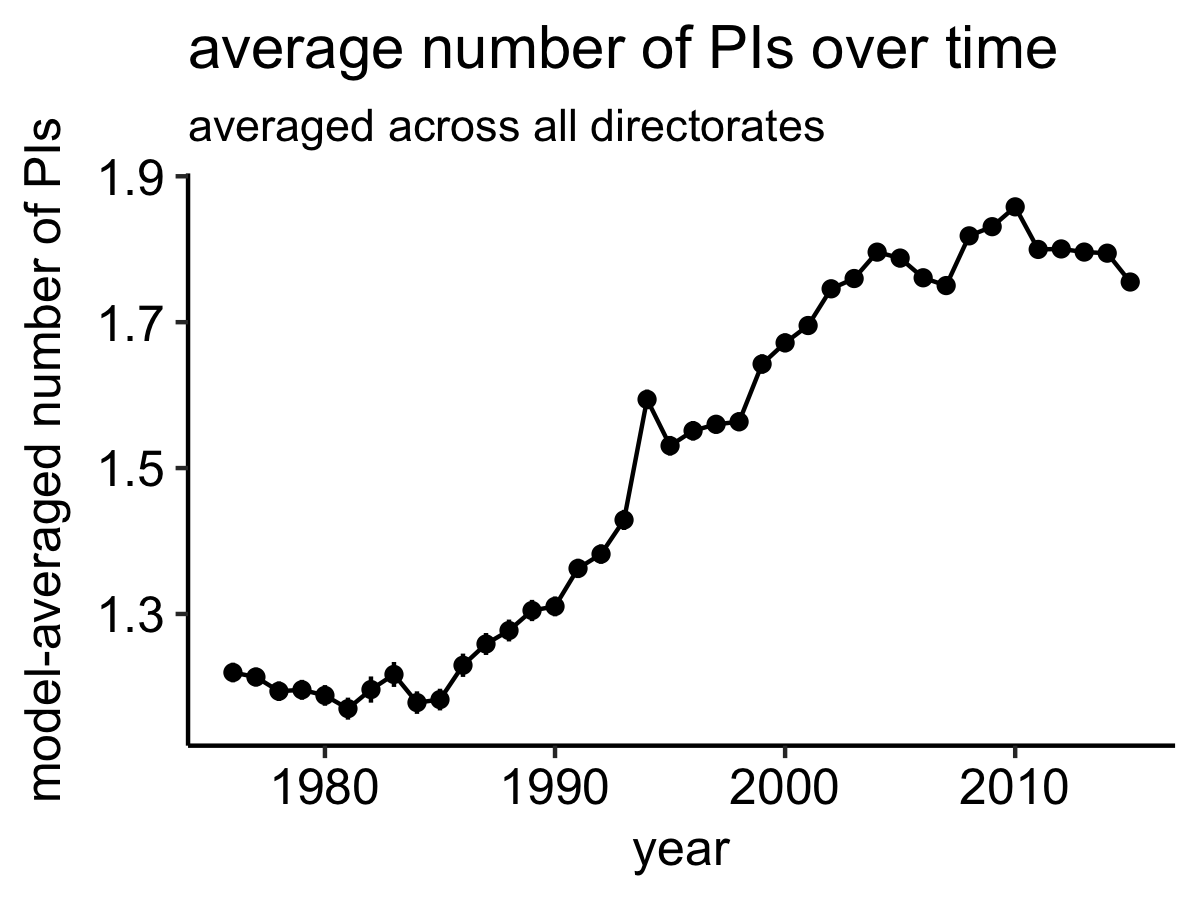
Again, the pattern is clear: the number of PIs on NSF grants appears to be increasing. This plot seems to suggest that the number of PIs might be leveling off—the average number of PIs hasn’t changed much since in the last decade, though the previous two decades saw pretty substaintial increases.
We can take a similar appraoch, this time averaging across years, to show that the average number of PIs is unusually high for grants in Education and Human Resources:
lsmeans(model, "directorate") %>%
  tidy %>%
  ggplot(aes(x = directorate, y = estimate)) +
  geom_col(aes(fill = directorate)) +
  theme_pubr() +
  scale_fill_world(guide = F) +
  rotate_labels() +
  ylab("model-averaged number of PIs") +
  ggtitle("average number of PIs in each directorate", subtitle = "averaged across years") +
  theme( axis.text.x = element_text(size = 10))
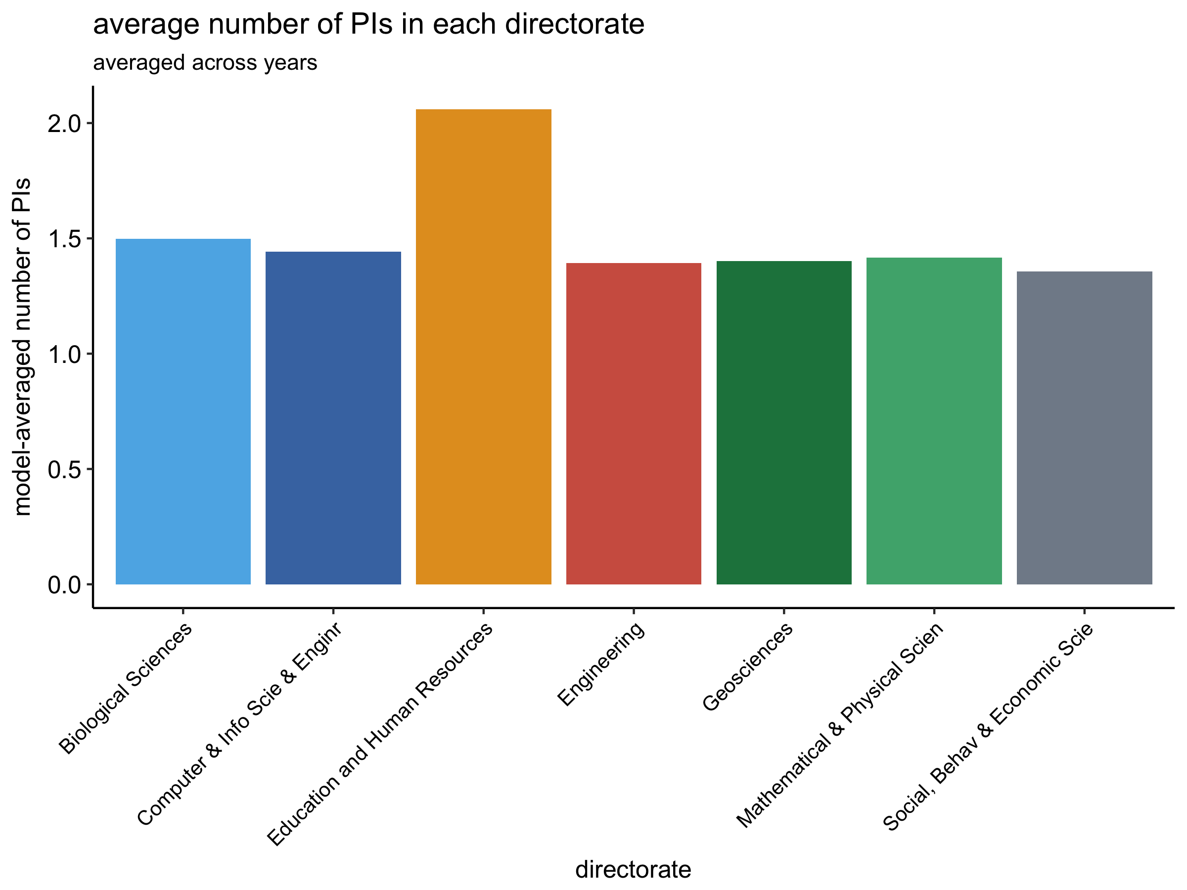
All other directorates have rouhgly the same number of average PIs.
take-aways
- the average number of PIs on NSF has increased over time
- PIs in the Education and Human Resources directorate tend to be highly collobarative
lsmeans+broomis handy for visualizing estimated marginal means