Awards at NSF part iii
I’ve been blogging recently about some analyses I’ve put together on funding at the National Science Foundation (NSF) over time.
In the first post, I used beautifulsoup in Python to extract relevant data from XML files, and in the second I did some basic natural language processing with the great tidytext package, which I’ll expand on soon.
In the meantime I was excited to try out Claus Wilke’s ggjoy package which makes it super easy to produce joy plots. Some part of me doesn’t like joy plots because the y-axis has two meanings and is therefore ambiguous; but for cool data visualizations it’s great and I’ve found it to be a nicer visual to something like a series of box plots or a sinaplot.
I have two goals here. The first is to just show to implement a joy plot and how it can be used to visualize distributions over time.
The second is to show the power of faceting. I was admittedly hesitant to use ggplot2 for a long time. I read Hadley’s ggplot book and it seemed overly pedantic to me; I wasn’t sure what benefit I was gaining from using it. Over time I learned the many reasons why it makes way more sense to use ggplot2 than base R graphics, but if you need one reason, it’s faceting. Faceting–the ability to create multiple plots, each representing a subset of your data–can provide such a deeper insight into your data. And it just takes a single line of code, instead of a bunch of calls to subset().
geom_joy
I’ve previous created a data frame called df, one row for each NSF grant awarded over $10k since 1975. I picked $10k as an arbitrary cutoff because I wanted to exclude some seriously tiny grants I didn’t understand. I also wanted to exclude DDIGs, but as we see below, this was a silly threshold to choose for that.
Below I tell geom_joy, which is the geom that implements to joy plot, to draw the curves based on density, or the number of observations along the x-axis. Note that I can use geom_ridgeline if I want to specify some other variable that will dictate the height of the curve.
library(ggjoy)
source("https://raw.githubusercontent.com/lukereding/random_scripts/master/plotting_functions.R") # source some plotting scripts I use


df %>%
  mutate(year = lubridate::year(date_start)) %>% # make a column for the year
  filter(year > 1975) %>% # years before 1975 are unreliable
  ggplot(aes(x = amount, y = year, group = year, height = ..density..)) +
  geom_joy(scale = 5, color = "white") + # add the joy plot
  scale_y_reverse() + # reverse the y axis
  scale_x_log10(breaks = c(50000, 100000, 1000000, 5000000),
                label = c("$50k", "$100k", "$1mil", "$5mil")) + # create a log scale for the x axis
  theme_mod() + # add minimal theme
  rotate_labels(35) # rotate the labels so they don't overlap
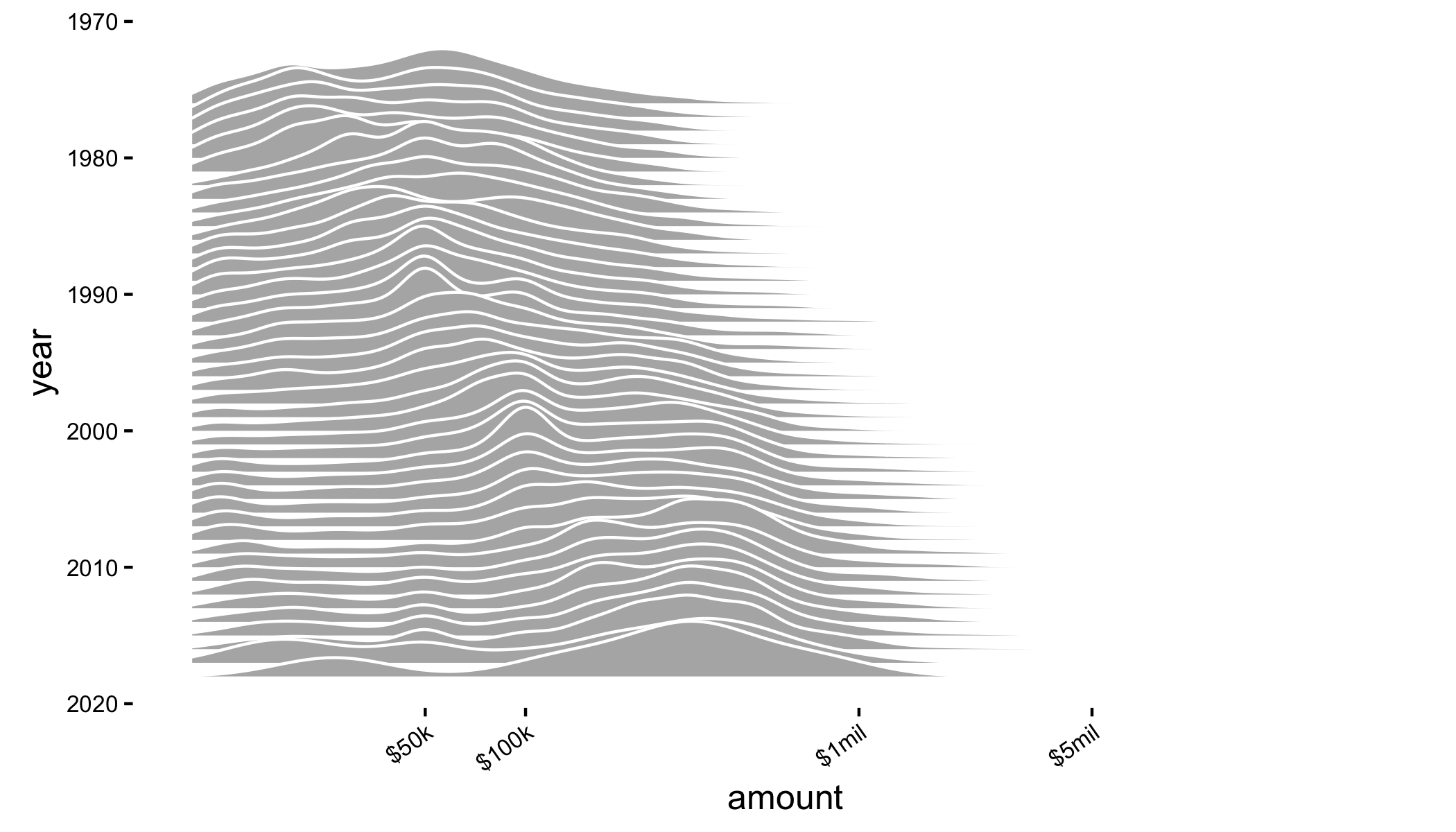
The height of each curve is the number of grants that were awarded for a given value on the x-axis.
Honestly, this plot isn’t terribly interesting. Grant awards at NSF are getting larger over time: this is what we expect to happen with, among other things, inflation.
faceting
We can gain some real insights by breaking this plot up by directorate (physics/math, biology, etc.), however. Note that the only difference between the code above and this code is the addition of the call to facet_wrap:
df %>%
  mutate(year = lubridate::year(date_start)) %>%
  filter(year > 1975) %>%
  ggplot(aes(x = amount, y = year, group = year, height = ..density..)) +
  geom_joy(scale = 5, color = "white") +
  scale_y_reverse() +
  scale_x_log10(breaks = c(50000, 100000, 1000000, 5000000),
                label = c("$50k", "$100k", "$1mil", "$5mil")) +
  theme_mod() +
  rotate_labels(35) +
  facet_wrap(~directorate)
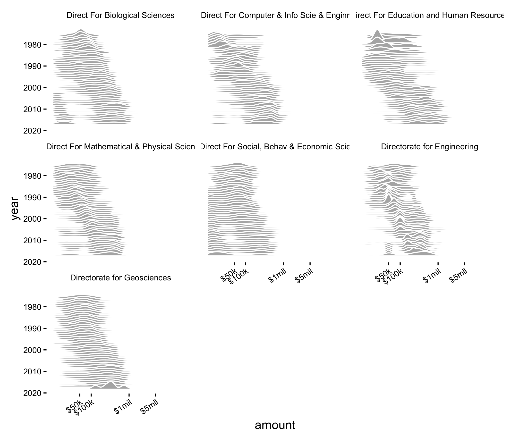
The overall pattern here is the same: the average NSF grant is funded for more money now than in the past, which is, again, what we expect to see.
But additionally, we start to see some interesting patterns. For example, we see a small cluster of small grants in biology and economics/behavioral sciences. These are most likely DDIGs, small grants given to PhD students in support of their research. The biological sciences recently got rid of these, so presumably we’ll see this peak disappear soon. Notably, economics/behavioral sciences still has a DDIG award, unlike many of the other directorates.
Whereas many of the curves for the directorates look relatively smooth, the curves for the engineering seem to have a lot less variance, but have started funding some ~$50k grants in the last ~15 years.
Finally, one thing I notice is the ‘valleys’ present is some of these plots, representing troughs in a bimodal distribution. These are particularly evident in recent years for the education and human resources directorate. Other directorates, like math/physics and engineering (with some exceptions) are fairly unimodal.
wrap up
ggjoyimplements a really cool geom that is dead simple to use. It’s useful when plotting tens of distributions in a really pleasing, intuitive way- faceting is a huge strength of
ggplot2and allows greater insight into subsets of your data