Awards at NSF part ii
This is one in a continuing series of blog posts looking at funding at NSF and what the data NSF provides can tell us about science in the US and how it changes over time.
In a previous post I showed how to download that data NSF provided on their funded grants, like the amount of the grant and the abstract of the grant, and save it as a csv file. Today we’ll look at some trends looking only at the text from the abstract of the grant.
cleaning the data
In the previous post we saved a file called out.csv that contained a row for each grant and a column for each of the variables we extracted from the xml files we downloaded. But a quick glance at our csv file shows us a couple of ways we might improve it.
First, there are several typos / renames in thedirectorate and division variables. After reading in the dataframe as df with read_csv, I use the fct_recode from the great forcats package to recode some of the factors to make the names more consistent:
df$directorate %<>% factor
df %<>%
  mutate(directorate = forcats::fct_recode(directorate,
    "Directorate for Engineering" = "Directorate For Engineering",
    "Direct For Biological Sciences" = "Directorate for Biological Sciences",
    "Office Of The Director" = "OFFICE OF THE DIRECTOR",
    "Direct For Social, Behav & Economic Scie" = "Directorate for Social, Behavioral & Economic Sciences",
    "Directorate for Geosciences" = "Directorate For Geosciences",
    "Direct For Mathematical & Physical Scien" = "Directorate for Mathematical & Physical Sciences",
    "Direct For Computer & Info Scie & Enginr" = "Directorate for Computer & Information Science & Engineering",
    "Direct For Education and Human Resources" = "Directorate for Education & Human Resources"))
(The command with the %<>% above is equivalent to df$directorate <- factor(df$directorate), it’s just less clutered). I also convert the dates to the correct type using the lubridate package. This is actually really important because otherwise R treats these dates as strings, which isn’t useful at all:
df$date_start %<>% lubridate::mdy(.)
df$date_end %<>% lubridate::mdy(.)
df$duration <- df$date_end - df$date_start
Lubridate has an awesome collection of functions that make it really easy to convert a date in any format into a date. I also add a column called duration which gives the duration of a grant, because I suspect that the duration of a grant might be related to the amount the grant is funded for.
When checking out some of the abstracts, I noticed that there were some funky formatting issues, like the presence of < /> tags. To get rid of these, I use gsub to replace them with a space:
df %<>%
  mutate(abstract = gsub("< />", " ", abstract))
I also winnow done the grants that’s I’m interested in. For this analysis, I’m really only interested in big NSF grants. This dataset also contains DDIGs (may they rest in peace), but keeping them in the datasets would be like comparing apples and oranges:
df %<>%
  filter(directorate %in% c(
    "Direct For Biological Sciences",
    "Direct For Computer & Info Scie & Enginr",
    "Direct For Education and Human Resources",
    "Direct For Mathematical & Physical Scien",
    "Direct For Social, Behav & Economic Scie",
    "Directorate for Engineering",
    "Directorate for Geosciences"
  )) %>%
  filter(amount > 10000) %>%
  filter(`grant type` == "Standard Grant")
Here, I only take standard grants in the most common directorates that are worth more than $10,000.
Finally, I’m going to save this dataframe as both a csv file and a feather file, a binary format that is faster and read and write and can be used between R and Python with feather format package.
# write as a feather file
df %>%
  write_feather("out_cleaned.feather")

# write as a csv file
df %>%
  write_csv("out_cleaned.csv")
Feather is fast but not guarenteed to be stable in the future; csv files are easy to work with and human readable, so it makes sense to save the data in both formats.
There are some additional cleaning steps I take which are shown in the cleanup.R in the Github repo associated with these posts.
tokenization
Our goal in this post is to look at patterns of text in the abstracts of awarded NSF grants. Natural language processing (NLP) tasks—having a computer try to make sense out of text—generally first relies on text tokenization: breaking text up into words. tidytext is an awesome library for working with text in R is a tidy format. They even have a book online that shows the power and simplicity of using the package.
tidy data
But first: What is tidy data? The concept of tidyness was originally put forth by (like most modern ideas in R) by Hadley Wickham in a paper of the same name. Wickham’s excellent R for Data Science (available for free online at that link) has an entire chapter devoted to the idea. The priciples are pretty simple:
- Each variable has its own column.
- Each observation has its own row.
- Each value has its own cell.
I admit I was super unimpressed when I read these guiding principles. I never understood what was to be gained by taking this approach. Over time, I’ve realized I’ve powerful it can be:
- It clarifies your thinking. Once you adopt the tidy perspective, you stop getting weird error messages when you plot things or try to reshape your data: you’re forced to ask yourself what the variables are and what the observations are. In today’s world of big data, the two cna get confused. Plus, if you work with any of the modern R packages that are mainstream now (i.e. the tidyverse packges), you’re basically forced to have your data in a tidy format (thus the name tidyverse).
- It’s easy to reshape your data. Having your data in tidy format makes it malleable: it can transform relatively easily into whatever form you need it to be in depending on your question.
Basically, things started to make sense and my head was clearer once I adopted the tidy approach. It has it’s drawbacks—I find myself having to reshape data just to do a test often when my data are tidy—but the costs clearly outweigh the benefits.
The tidytext package applies the tidy principles above to analyzing text.
back to tokenization
Tokenization in tidytext is super simple. Let’s first read in our dataframe:
library(feather)
library(tidyverse)
library(magrittr)

df <- read_feather("out_cleaned.feather")
To tokenize, all we do is unnest the words into the abstract into their individual tokens:
library(tidytext)

df %>%
  unnest_tokens(word, abstract)
removing stop words
If you run this on this dataset, it’ll take a long time. And the first thing you’ll notice when you look at the most common words is that there are a lot of words that aren’t particularly informative, words like a and the. These are called stop words. They’re words that are too general to be informative. So we want to remove those with an anti-join. This will exclude all the rows (observations) in our dataframe that are stopwords. If you have the tidytext package loaded, you just need to run data("stop_words") to access them.
So the next step is adding the anti-join:
df %>%
  unnest_tokens(word, abstract) %>% # tokenize
  anti_join(stop_words) # remove stop words
If you run this, you’ll notice that are lot of the most common words are pretty boring and do little to separate out the different disciplines, words like ‘science’, ‘project’, ‘data’. I’ll call those scientific stop words. I’ll remove those in our next series of commands.
Because I’m interested in comparing the different scientific disciplines that NSF funds, I’m going to group the data by directorate. Biology, chemistry, engineering each have their own directorate. I’m interested in how the language used in each directorate differs from other directorates.
Because I’m also interested in looking at word trends through time, I’m going to group by year as well.
My next call to R looks like this:
common_words <- df %>%
  unnest_tokens(word, abstract) %>% # tokenize
  anti_join(stop_words) %>% # remove stop words
  filter(!word %in% c("research", "data", "project", "students", "science", "learning", "student", "study", "provide", "program", "university","based", "provide","studies", "provide", "understanding", "biology", "engineering", "education", "processes", "social")) %>% # remove common 'science' stop words
  group_by(directorate, year) %>% # group by directorite
  count(word, sort = TRUE) %>% # count in the number of each word in each directorate
  mutate(word = reorder(word, n), percent = n / n() * 100, number = n()) %>% # get the percent and reorder the words
  filter(!is.na(directorate)) # remove any NA directorates
There’s a lot going on here, but I’m building on the previous commands. The next step was to filter out those ‘scientific stop words’, and then group_by directorate. I then use count to count the number of times each word occurred in each abstract in each directorate. I then use mutate to order the word column by the most frequently-used words and create a new column called percent that lists the percent of abstracts in each directorate that contain that word. I then get rid of any words that came from an abstract where I couldn’t parse the directorate.
Now we have a dataframe that contains a lot of the plotting data we want in the correct format. If you just want to play with the data starting here, I’ve saved the above data frame as as .Rdata file on the GitHub site associated with the blog series.
plot word frequencies
Let’s go ahead and plot the top five most frequent words in each directorate:
source("https://raw.githubusercontent.com/lukereding/random_scripts/master/plotting_functions.R")
library(ggthemes)


common_words %>%
  top_n(5, percent) %>%
  ggplot(aes(x = word, y = percent)) +
  geom_col(aes(fill = directorate)) +
  facet_wrap(~directorate, scales = "free_x") +
  scale_fill_alpine(guide = F) +
  theme_fivethirtyeight() +
  rotate_labels() +
  remove_ticks_x() +
  theme(panel.grid.major.x = element_blank())
(Note here that I’m using some functions and ggplot2 scales that I wrote and are available by running the source line in the code above.)
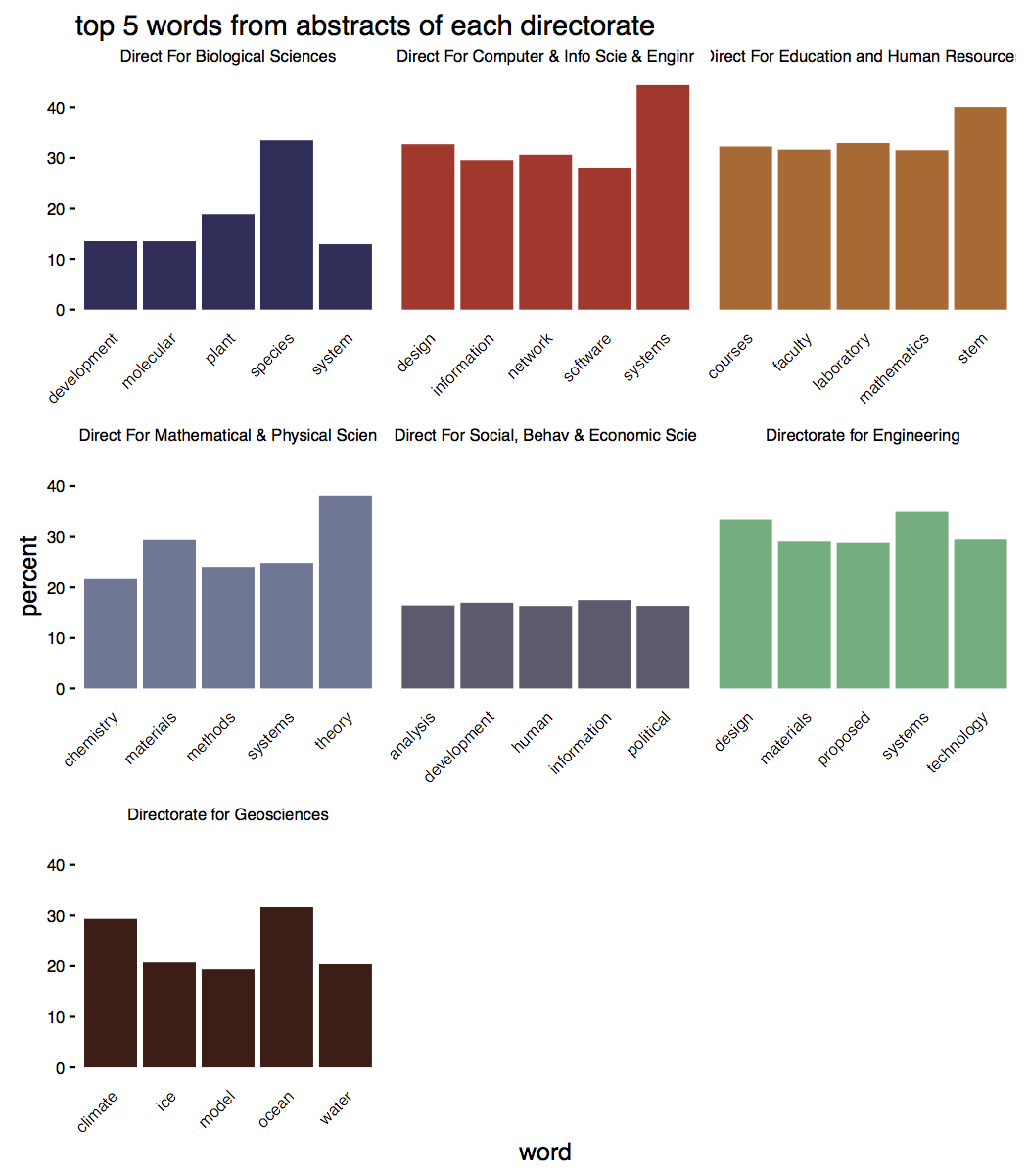
Most of these words shouldn’t be too surprising: biologists talk about species, educators mentions STEM fields, geosciences study ice and climate changes.
What’s most interesting to me is the uniformity apparent in the language of abstracts. 40% of physics abstracts use ‘theory’, roughly a third of biology abstracts use ‘species, and a third of abstracts in the geosciences use ‘ocean’. Obviously abstracts in geosciences, for example, have a lot in common, but at the same time, there’s a ton of diversity within disciplines.
But our data provides an opportunity for a richer analysis: we can look at changes in word frequency through time:
common_words_by_year <- df %>%
  mutate(year = lubridate::year(date_start)) %>% # create column for year
  unnest_tokens(word, abstract) %>% # tokenize
  anti_join(stop_words) %>% # remove stop words
  filter(!word %in% c("research", "data", "project", "students", "science", "learning", "student", "study", "provide", "program", "university","based", "provide","studies", "provide", "understanding")) %>% # remove common 'science' stop words
  group_by(directorate, year) %>% # regroup
  count(word, sort = TRUE) %>% # count in the number of each word in each directorate
  mutate(word = reorder(word, n), percent = n / n() * 100, number = n()) %>% # get the percent and reorder the words
  filter(!is.na(directorate)) %>% # remove any NA directorates
  filter(year <= 2015 & year > 1990)
We could now choose a few choice words and look at their frequency over time:
common_words_by_year %>%
  filter(word %in% c("theory", "stem", "active", "speciation", "climate")) %>%
  ggplot(aes(x = year, y = percent, group = word, color = word)) +
  geom_line() +
  facet_wrap(~ directorate) +
  scale_color_alpine() +
  ylab("percent of abstracts containing the word") +
  theme_mod() +
  add_axes()
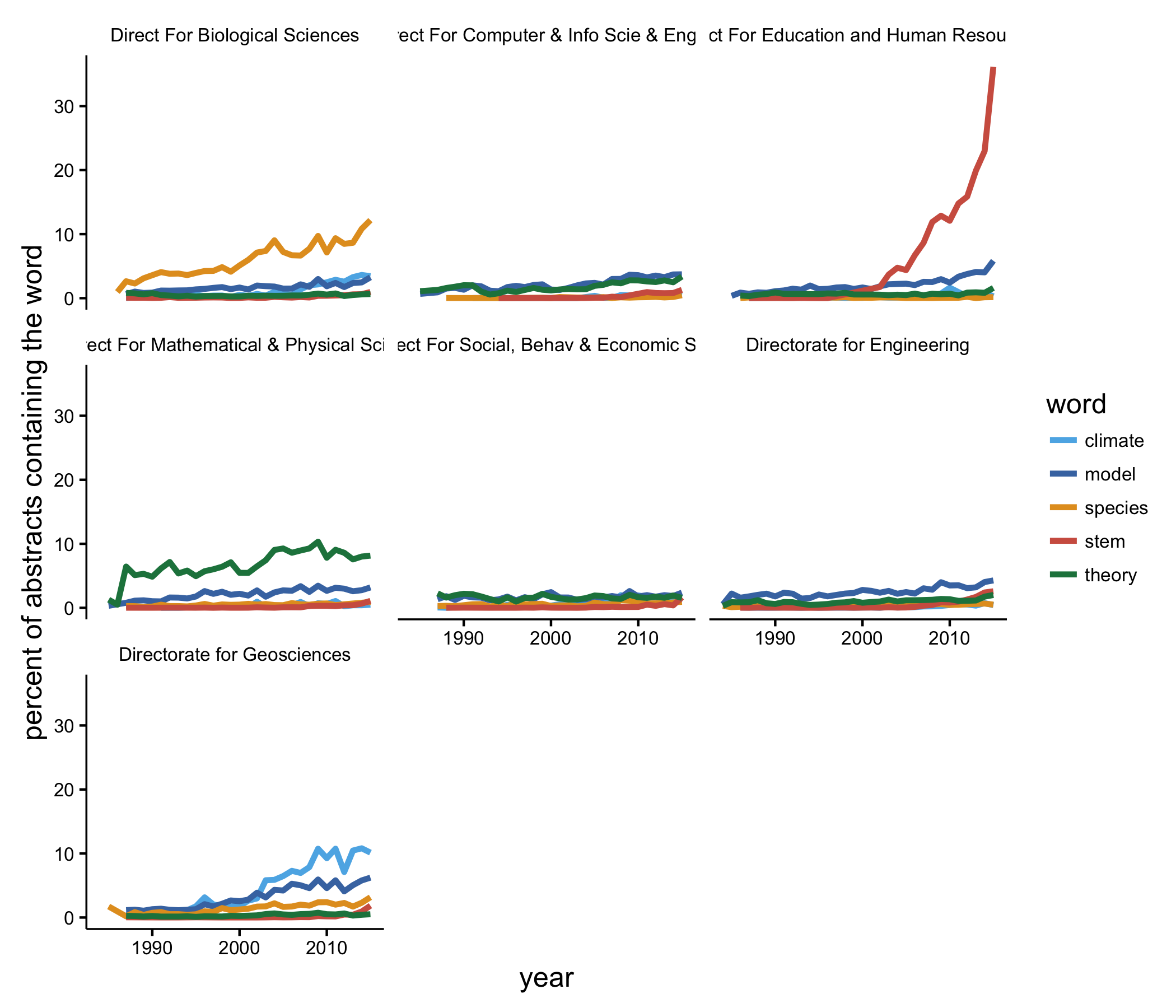
Now things are a bit more interesting. Biologists are using ‘species’ more now than in the past. The use of ‘STEM’ in abstracts by educators has exploded, which makes since since the acronym probably came into existence in the early 2000s, which agrees well with what we see. Math and physics types have always been about theory, and researchers in the geosciences are using ‘climate’ and ‘model’ more often than they did 25 years ago.
But these were just same random words I decided to look at. It’s perhaps more informative to plot the percentages of some common words over time. We first find the 10 most common words used in grant abstracts:
most_common <- common_words %>%
  ungroup %>%
  arrange(desc(n)) %>%
  slice(1:10) %>%
  pull(word)
Then we can plot their percentages over time:
common_words_by_year %>%
  filter(word %in% most_common) %>%
  ggplot(aes(x = year, y = percent, group = directorate, color = directorate)) +
  geom_line() +
  scale_color_alpine() +
  theme_mod() +
  facet_wrap(~ word) +
  scale_fill_continuous(guide = guide_legend()) +
  theme(legend.position="bottom") +
  theme(legend.text=element_text(size=6.5)) +
  add_axes() +
  ggtitle("percent of abstracts that contain some common words over time")
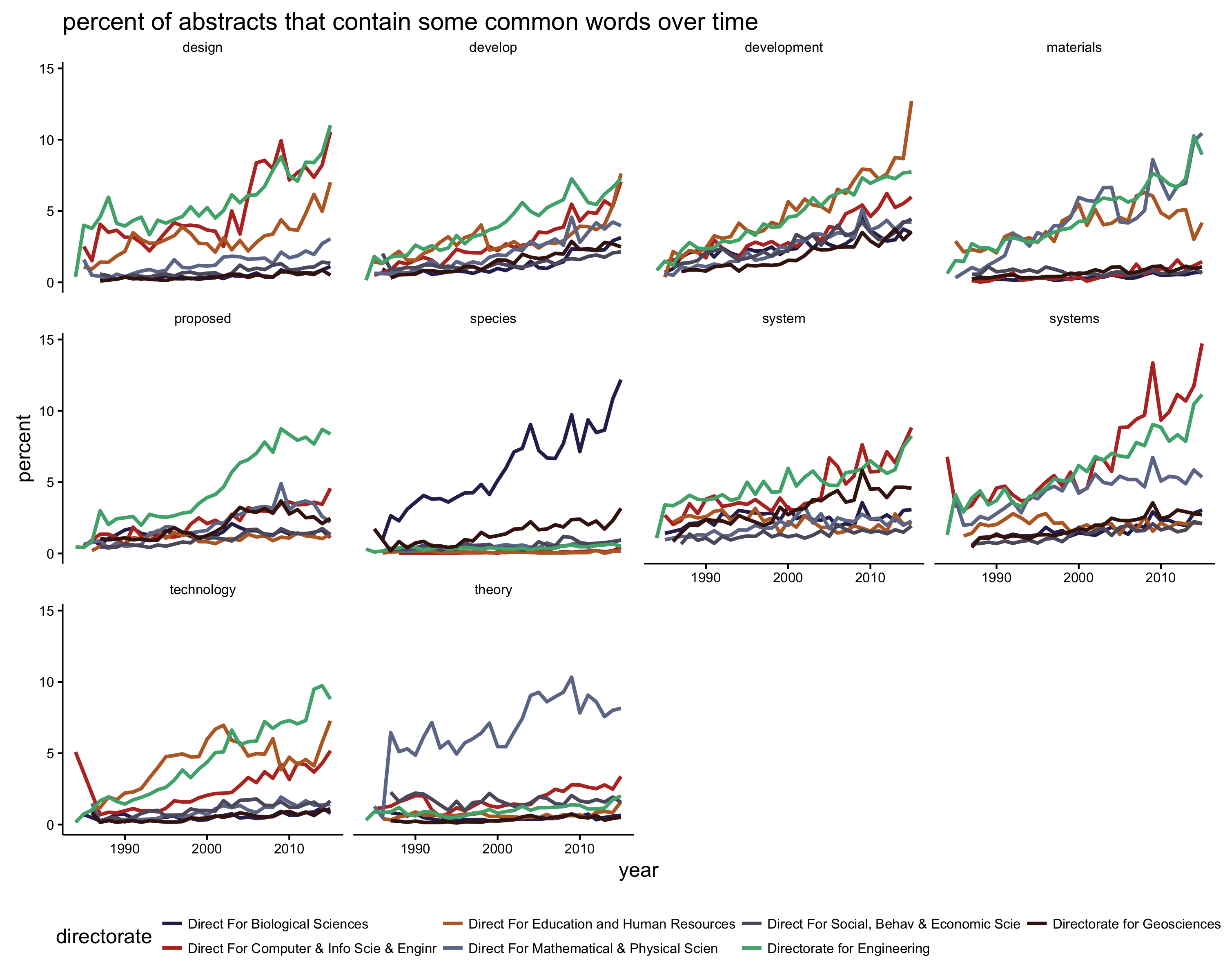
This graph is a bit overwhelming, but we can pull out a few findings. ‘Species’ is mostly just used by biologists. ‘Technology’ gets used heavily in engineering, computer science, and education; more so in recent years. The use of ‘theory’ is mostly confined to math and physics researchers; other disciplines use the word at a very low frequency. And ‘develop’ and ‘development’ are becoming more common over time in general.
In a future post I’ll look more at what influences funding amounts, which institutions rake in the most money from NSF, whether there are sex differences in funding rates. I’ve also created a ‘abstract generator’ trained on abstracts that you can jokingly use to create your next grant abstract. I’ll throw that up on a website sometime soon.